Five Pager Indicator Animations
Learn how to animate a pager indicator along with five examples

In the previous parts of this series, we looked at how to set up the Pager and how to animate its transitions.
Here we shall look into how to create custom animated Pager indicators.
Using Accompanist library
There is already an accompanist library that enables us to create beautiful animated indicators out of the box. For this option, I would recommend their already useful guide on how to set it up.
They have a tutorial on how to set up basic indicators to a scrolling tabs with titles.
If that's all you need for now, you could stop reading.
If you want to see some unreasonable convoluted ways of animating indicators, come with me.
Calculating Values
Just like with the transitions, the PagerState will be our friend here. We can create animations based on the state it produces. In part two, I explained the values produced by PagerState and how we can transform them with extension functions.
For this article, I shall build off of that and make another extension function that will help us create indicators.
fun PagerState.offsetForPage(page: Int) = (currentPage - page) + currentPageOffsetFraction

// NEW FUNCTION FOR INDICATORS
fun PagerState.indicatorOffsetForPage(page: Int) =  1f - offsetForPage(page).coerceIn(-1f, 1f).absoluteValue
This works by giving the current page a value of 1f and very other page as 0f. And then it progresses between 0f and 1f based on how far the page has been swiped.
The animation below shows the values change as the pages are swiped.
Using this float value, we can make animations with anything that can be animated progressively (eg. scale, width, color, etc.)
Now let us look at how to apply this function with some examples
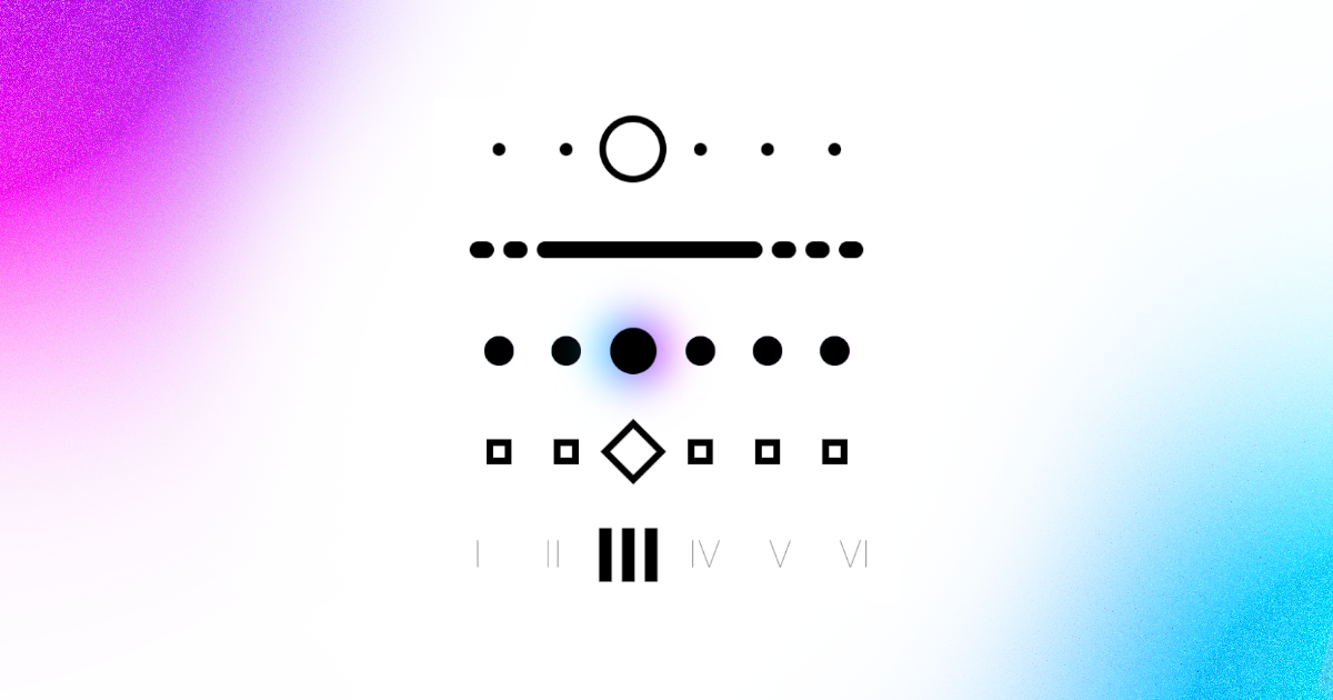
1. Circle Indicator
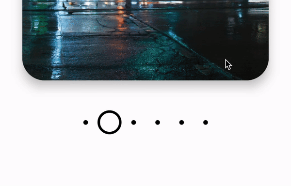
For this indicator, we create a circle border and just animate the size of the shape. We do this by getting offset using the extension function, indicatorOffsetForPage.
With this float value, we can animate the size using a lerp function.
@OptIn(ExperimentalFoundationApi::class)
@Composable
fun CircleIndicator(
    modifier: Modifier = Modifier,
    state: PagerState
) {
    Row(
        modifier = modifier
            .fillMaxWidth()
            .height(48.dp),
        verticalAlignment = Alignment.CenterVertically,
        horizontalArrangement = Arrangement.Center,
    ) {
        for (i in 0 until NUM_OF_PAGES) {
            val offset = state.indicatorOffsetForPage(i)
            Box(
                modifier = Modifier.size(32.dp),
                contentAlignment = Alignment.Center
            ) {
                Box(
                    Modifier
                        .size(
                            lerp(6.dp, 32.dp, offset)
                        )
                        .border(
                            width = 3.dp,
                            color = Color.Black,
                            shape = CircleShape,
                        )
                )
            }
        }
    }
}
2. Line Indicator
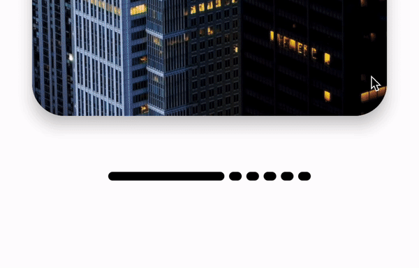
Other than the size of a composable, we can also animate the weight. We can use this to make the selected index to appear larger than the rest.weight indicates how much space a composable should take, respective to its sibling composables and its parent size. For example, if all composables had a weight of 1f, then they would take up the same amount of space.
But if one composables has a larger weight, it will take up more space than its siblings. So we can use the indicatorOffsetForPage function to calculate the weight like so:
@OptIn(ExperimentalFoundationApi::class)
@Composable
fun LineIndicator(
    modifier: Modifier = Modifier,
    state: PagerState
) {
    Row(
        modifier = modifier
            .width(32.dp * NUM_OF_PAGES)
            .height(48.dp),
        verticalAlignment = Alignment.CenterVertically,
        horizontalArrangement = Arrangement.Center,
    ) {
        for (i in 0 until NUM_OF_PAGES) {
            val offset = state.indicatorOffsetForPage(i)
            Box(
                modifier = Modifier
                    .padding(horizontal = 2.dp)
                    .weight(.5f + (offset * 3f))
                    .height(8.dp)
                    .background(
                        color = Color.Black,
                        shape = CircleShape
                    ),
                contentAlignment = Alignment.Center
            ) {

            }        }
    }
}
3. Glow Indicator
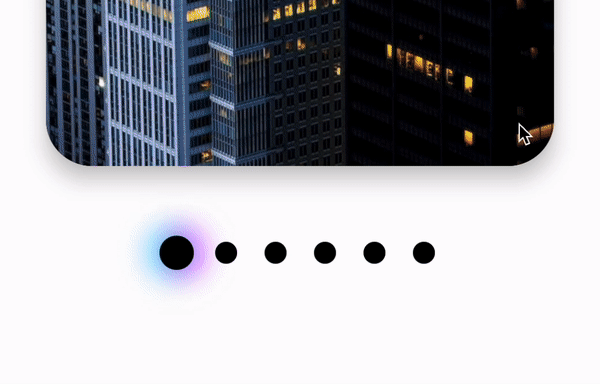
We have already learned how to animate the size of a circle for a pager indicator. In this example, we just have to do this twice.
The "background" circle will animate to larger size than the "foreground", but still start from the same size value.
On top of that, we will animate a blur on the "background" circle using the offset value. Add a vibrant gradient as the background, et voila!
@OptIn(ExperimentalFoundationApi::class)
@Composable
fun GlowIndicator(
    modifier: Modifier = Modifier,
    state: PagerState
) {
    Row(
        modifier = modifier
            .fillMaxWidth()
            .height(48.dp),
        verticalAlignment = Alignment.CenterVertically,
        horizontalArrangement = Arrangement.Center,
    ) {
        for (i in 0 until NUM_OF_PAGES) {
            val offset = state.indicatorOffsetForPage(i)
            Box(
                modifier = Modifier
                    .size(32.dp),
                contentAlignment = Alignment.Center
            ) {
                Box(
                    Modifier
                        .size(
                            lerp(14.dp, 32.dp, offset)
                        )
                        .blur(
                            radius = lerp(0.dp, 16.dp, offset),
                            edgeTreatment = BlurredEdgeTreatment.Unbounded,
                        )
                        .background(
                            brush = Brush.horizontalGradient(
                                colors = listOf(
                                    Color.Cyan,
                                    Color.Magenta,
                                )
                            ),
                            shape = CircleShape
                        )
                )
                Box(
                    Modifier
                        .size(
                            lerp(14.dp, 22.dp, offset)
                        )
                        .background(
                            color = Color.Black,
                            shape = CircleShape,
                        )
                )
            }
        }
    }
}
4. Square Indicator
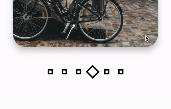
This one also has a size animation, but the extra twist;) is that we rotate the composable using the offset.
This is easily done by multiplying the offset by the max degrees, and passing that into the rotate modifier.
Hopefully, from this you can see that we can use the offset to manipulate anything, be it a modifier or a parameter of a composable.
@OptIn(ExperimentalFoundationApi::class)
@Composable
fun SquareIndicator(
    modifier: Modifier = Modifier,
    state: PagerState
) {
    Row(
        modifier = modifier
            .fillMaxWidth()
            .height(48.dp),
        verticalAlignment = Alignment.CenterVertically,
        horizontalArrangement = Arrangement.Center,
    ) {
        for (i in 0 until NUM_OF_PAGES) {
            Box(
                modifier = Modifier.size(32.dp),
                contentAlignment = Alignment.Center
            ) {
                val offset = state.indicatorOffsetForPage(i)
                Box(
                    Modifier
                        .rotate(135f * offset)
                        .size(
                            lerp(12.dp, 22.dp, offset)
                        )
                        .border(
                            width = 3.dp,
                            color = Color.Black,
                            shape = RectangleShape,
                        )
                )
            }
        }
    }
}
5. Roman Numeral Indicator
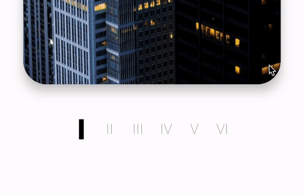
Lastly, this is an example to show that any value we can lerp, we can use that for our indicator.
In a previous article, I wrote about a lerp function in compose for TextStyle. This function animates between font sizes, colors, font weights, etc. It just needs two TextStyles and a float (our lovely offset of course).
@OptIn(ExperimentalFoundationApi::class)
@Composable
fun RomanNumeralIndicator(
    modifier: Modifier = Modifier,
    state: PagerState
) {
    Row(
        modifier = modifier
            .fillMaxWidth()
            .height(48.dp),
        verticalAlignment = Alignment.CenterVertically,
        horizontalArrangement = Arrangement.Center,
    ) {

        val selectedTextStyle = remember {
            TextStyle(
                fontSize = 36.sp,
                fontWeight = FontWeight.Black,
                color = Color(0xFF000000)
            )
        }

        val defaultTextStyle = remember {
            TextStyle(
                fontSize = 18.sp,
                fontWeight = FontWeight.Thin,
                color = Color.Black.copy(alpha = .5f)
            )
        }

        for (i in 0 until NUM_OF_PAGES) {
            Box(
                modifier = Modifier
                    .size(height = 48.dp, width = 36.dp)
                    .align(Alignment.CenterVertically),
                contentAlignment = Alignment.CenterEnd
            ) {
                val offset = state.indicatorOffsetForPage(i)
                Text(
                    text = (i + 1).toRomanNumeral(),
                    modifier = Modifier.fillMaxWidth(),
                    style = lerp(defaultTextStyle, selectedTextStyle, offset),
                    textAlign = TextAlign.Center,
                )
            }
        }
    }
}
That's all for now. I hope some of these sparked your creativity on what you can create.
Thanks for reading and good luck!
Subscribe for UI recipes