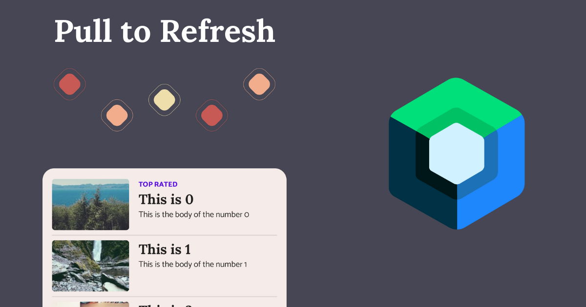
Custom Pull to Refresh in Jetpack compose

Deprecated -> Go to updated article https://www.sinasamaki.com/custom-pull-to-refresh-in-jetpack-compose-2/
Pull to refresh is a common design pattern that is used by the user to refresh a list of items. In jetpack compose, we can use the accompanist library to implement the default implementation in most material design apps. But given the interactive nature of this design pattern, there is a lot of opportunity to delight the user with animations and feedback. Today, we will learn how to implement a custom pull to refresh animation in compose.

Basic Implementation
We will be building off of the available accompanist library. It does have the default implementation, but it also provides freedom to customize to our liking.
// Add the library to your project
implementation "com.google.accompanist:accompanist-swiperefresh:0.24.9-beta"
Next we will create a wrapper composable where we will implement our custom logic and fill it with a sample UI.
CustomPullToRefresh(
isRefreshing = isRefreshing,
onRefresh = { refresh() }
) {
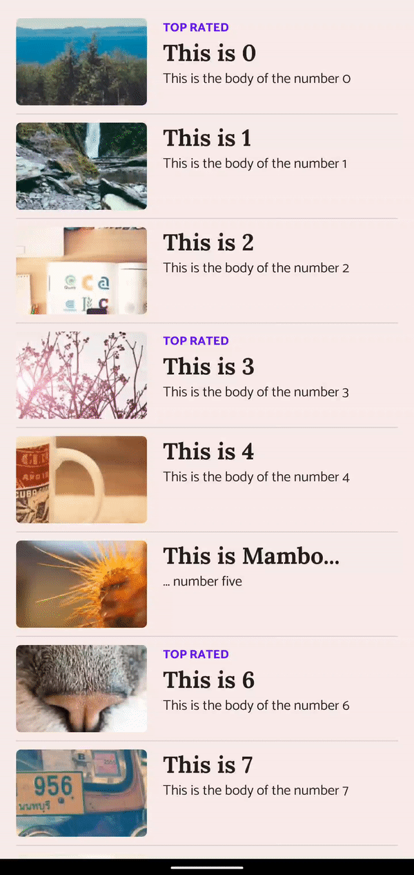
LazyColumn {
items(100) { index ->
ListItem(index = index)
}
}
}
Inside the CustomPullToRefresh composable, we can add the SwipeRefreshcomposable from the accompanist library. In the indicator parameter, we can decide how our custom indicator should look like.
@Composable
fun CustomPullToRefresh(
    modifier: Modifier = Modifier,
    isRefreshing: Boolean,
    onRefresh: () -> Unit,
    content: @Composable () -> Unit,
) {
	...
	SwipeRefresh(
	    modifier = modifier,
	    state = pullState,
	    onRefresh = onRefresh,
	    refreshTriggerDistance = trigger,
	    indicator = { state, triggerSize ->
			// Custom indicator logic here
	    }
	) {
		// List content
	}
}
The indicator parameter accepts a composable function and passes in data that we can use to build a custom indicator. The state variable holds data like how far the user has swiped and whether the list is still refreshing, and triggerSize is how big the trigger area is.
For my custom implementation, I am using three states to build the UI:
- isSwiping (The user is currently swiping)
- willRefresh (The user has swiped passed the
triggerSize. A release at this point will trigger a refresh) - isRefreshing (Refresh is in progress)
val willRefresh = state.indicatorOffset.roundToInt() > triggerPx

offset = when {
    willRefresh -> triggerPx.roundToInt() + (state.indicatorOffset.roundToInt() * .1f).roundToInt() // willRefresh
    state.isRefreshing -> triggerPx.roundToInt() // isRefreshing
    else -> state.indicatorOffset.roundToInt()  //isSwiping
}
We can use these states to provide feedback to the user. In this case, we are using them to determine the offset of the indicator. If a release will cause a refresh, we can communicate this to the user by popping the offset a little further. We could also add some haptic feedback when this point is reached. While a refresh is happening, we hold the value of the offset at the trigger position. If none of these are true, we use state.indicatorOffset.
For a test, we can use these values to create a basic indicator:
Box(
    modifier = Modifier
        .offset { IntOffset(0, -indicatorPx.roundToInt()) }
        .offset { IntOffset(y = offset, x = 0) }
        .background(
            color = when {
                willRefresh -> Color.Magenta
                state.isRefreshing -> Color.Green
                else -> Color.DarkGray
            },
        )
        .size(indicator)
)
This will create a square that moves with the offset and changes color based on the three states we have defined.
Fancy implementation
The basic implementation helps in understanding how to extend SwipeRefresh, but it should not be caught in an app in production. For that, we will use these states plus a few animations to create a fancier implementation that we can be proud of.
Animating the list content
The list takes up a large part of the screen, so animating it gives more feedback to the user that they are about to refresh the list.
val scale by animateFloatAsState(
    targetValue = if (willRefresh) .95f else 1f,
    animationSpec = spring(
        dampingRatio = Spring.DampingRatioMediumBouncy,
    )
)

Box(modifier = Modifier
    .scale(scale)
    .offset { IntOffset(x = 0, y = animatedOffset) }
    .clip(RoundedCornerShape(topStart = 20.dp, topEnd = 20.dp))
    .fillMaxSize()
    .background(MaterialTheme.colors.surface)
) {
    content()
}
We are now using the offset to move the list down. This has two main purposes. First, moving the content down so that we can put our fancy animation in the space above. Second, we get the benefits of the visual feedback of popping the offset when willRefresh is true. A few other additions are adding a scale animation when willRefresh is true and adding rounded corners to the top of the list.
Custom refresh indicator
For the indicator I have in mind, I want it to be revealed from behind the list as the user pulls the list down. For that reason, I added the indicator to the SwipeRefresh content, behind the list.
FancyRefreshAnimation(
    modifier = Modifier
        .align(Alignment.TopCenter)
        .fillMaxWidth(),
    isRefreshing = { pullState.isRefreshing },
    willRefresh = { offset > triggerPx },
    offsetProgress = { min(animatedOffset / triggerPx, 1f) }
)
At this point, imagination and creativity comes into play, and you could use the animation tools provided to you by compose to make something beautiful. Another option, if you have a design team or are gifted creating animations, would be to implement a custom Lottie animation here. In my case, I just made some rounded colored boxes and rotated them while refreshing. You can find the FancyRefreshAnimation composable here along with the rest of the sample project.
Thanks for reading and good luck!
Subscribe for UI recipes