Custom Pull to Refresh in Jetpack Compose
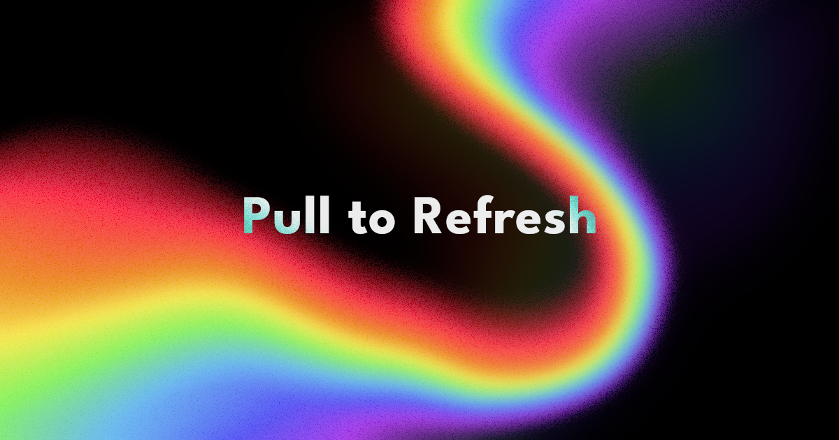
Create a colorful and animated pull to refresh indicator in Jetpack Compose
Over a year ago, I wrote an article on implementing Pull to Refresh pattern with the accompanist library. Since then, this has been deprecated in favor of the official implementation provided by Google in compose version 1.3.0.
In this article, I will cover how to use this new implementation, along with how to customize the indicator to achieve something like this:
Basic Implementation
First, we need to create the a PullRefreshState that keeps track of the state of refreshing. The state isRefreshing tells the indicator whether our data is currently refreshing. For the purposes of this example, we will be setting isRefreshing manually to true, then false after a delay.
var isRefreshing by remember { mutableStateOf(false) }
val scope = rememberCoroutineScope()
val pullRefreshState = rememberPullRefreshState(
    refreshing = isRefreshing,
    onRefresh = {
        scope.launch {
            isRefreshing = true
            delay(5_000L)
            isRefreshing = false
        }
    })
Note: inrememberPullRefreshStatewe can also pass inrefreshThreshold(the distance the user has to swipe to trigger a refresh) andrefreshingOffset(the offset of the refresh indicator)
Once we have our state, we can now build the UI. In the accompanist library, the pull to refresh functionality was in a custom Composable. Here, it is just a Modifier. Let's add it to a Box that contains our LazyColumn and pass in pullRefreshState into it.
Box(
    modifier = Modifier
        .background(Color(0xff000000))
        .pullRefresh(state = pullRefreshState)
) {
    LazyColumn {
        // LazyColumn items here
    }
    PullRefreshIndicator(
        refreshing = isRefreshing,
        state = pullRefreshState,
        modifier = Modifier.align(Alignment.TopCenter)
    )
}
After our LazyColumn we can add an indicator that will inform the user of their actions. We can use the default PullRefreshIndicator here and pass in isRefreshing and the pullRefreshState. This Composable will read the state of refreshing and render an indicator accordingly.
If all you needed was the default indicator, we are done here. But if you are looking to spice up your UI a little more, get your headphones and let's continue over to the Dark Side Of The Moon.
Haptic Feedback
This is a non visual cue we can add that will enhance the experience of our app. The user will feel when they have crossed the refresh threshold and know when it is ready to release.
To do this. we first need to pull the progress from pullRefreshState. This is a float value starting from 0f and it indicates how far the user has swiped. 0 is at rest and above 1 indicates a refresh will be triggered.
We can use this to derive a boolean of when a refresh will be triggered.
val willRefresh by remember {
    derivedStateOf {
        pullRefreshState.progress > 1f
    }
}
Once we have this, we can then use it to trigger some haptic feedback like so:
val hapticFeedback = LocalHapticFeedback.current
LaunchedEffect(willRefresh) {
    when {
        willRefresh -> {
            hapticFeedback.performHapticFeedback(HapticFeedbackType.TextHandleMove)
            delay(70)
            hapticFeedback.performHapticFeedback(HapticFeedbackType.TextHandleMove)
            delay(100)
            hapticFeedback.performHapticFeedback(HapticFeedbackType.LongPress)
        }

        !isRefreshing && pullRefreshState.progress > 0f -> {
            hapticFeedback.performHapticFeedback(HapticFeedbackType.LongPress)
        }
    }
}
Whenever willRefresh changes to true, we trigger a vibrate pattern. And when it willRefresh changes to false, but we are not refreshing, we trigger another vibrate pattern to indicate that the user has left the refresh threshold. (pullRefreshState.progress > 0f is to prevent a vibrate event at app launch).
Creating Space
The default refresh indicator goes over our content. But the custom indicator we will build will push the list down and create space for the animation. To do this, we can apply an offset to the cards.
Another approach would be to offset the whole LazyColumn itself. But for our animation, we will animate the cards individually so as to achieve a parallax effect.
val cardOffset by animateIntAsState(
    targetValue = when {
        isRefreshing -> 250
        pullRefreshState.progress in 0f..1f -> (250 * pullRefreshState.progress).roundToInt()
        pullRefreshState.progress > 1f -> (250 + ((pullRefreshState.progress - 1f) * .1f) * 100).roundToInt()
        else -> 0
    }, label = "cardOffset"
)
If the list is refreshing, we set the cardOffset to 250. Otherwise, we calculate the offset based on the progress of the swipe. If the progress is between 0 and 1, we use it to calculate directly the distance the user has moved the list.
When the progress reaches 1, it means that if the user releases, they will trigger a refresh. If we continue increasing the offset, the user will not know visually that they have hit a threshold. And if we just cap the progress to 1, the offset will stop abruptly which feels unnatural.
The best solution is to continue increasing the offset but at a slower rate. The change of speed creates the illusion of tension as the user continues pulling the list. This indicates, in a pleasing way that they have reached the refresh threshold and they are free to release.
To add a little more visual intrigue, we will also rotate the cards as they move down. Similar to the offset, we just animate the degrees we shall move based on the current state.
val cardRotation by animateFloatAsState(
    targetValue = when {
        isRefreshing || pullRefreshState.progress > 1f -> 5f
        pullRefreshState.progress > 0f -> 5 * pullRefreshState.progress
        else -> 0f
    }, label = "cardRotation"
)
Now that we have the values ready, let's apply them on our list items.
LazyColumn(Modifier.fillMaxSize()) {
    itemsIndexed(list) { index, item ->
        Box(
            modifier = Modifier
                .zIndex((list.size - index).toFloat())
                .graphicsLayer {
                    rotationZ = cardRotation * if (index % 2 == 0) 1 else -1
                    translationY = (cardOffset * ((5f - (index + 1)) / 5f)).dp
                        .roundToPx()
                        .toFloat()
                },
        ) { ... }
    }
}
Instead of items, itemsIndexed is used to build the LazyColumn so that we have access to the current index. The index will be very useful in offsetting the animations.
We apply the values inside a graphicsLayer Modifier in each of our cards. For the rotation, we rotate all the even cards one way and the odds to the other. And for the translation, we translate the first item the full distance. But subsequent cards are animated a fraction of the initial distance based on their position.
Note that there is also a zIndex modifier to adjust the draw order so that higher cards in the list are drawn over the ones below while they are overlapping.
Now we have the space for our animation. Let's build it!
Indicator
First, let's animate the container of our animation so that it appears from the top.
val animatedOffset by animateDpAsState(
    targetValue = when {
        isRefreshing -> 200.dp
        pullRefreshState.progress in 0f..1f -> (pullRefreshState.progress * 200).dp
        pullRefreshState.progress > 1f -> (200 + (((pullRefreshState.progress - 1f) * .1f) * 200)).dp
        else -> 0.dp
    }, label = ""
)

Box(
    modifier = Modifier
        .fillMaxWidth()
        .height(200.dp)
        .offset(y = (-200).dp)
        .offset { IntOffset(0, animatedOffset.roundToPx()) }
) { /* THE ANIMATION WILL GO HERE */ }
animatedOffset is calculated based on the progress, but like the card offset, we will also slow it down once it passes the refresh threshold. Next, we add a negative offset to the container so that it is off-screen and then we apply the animatedOffset so that it moves from the top of the screen in to view.
Next, the animation itself
This animation can broken into three parts.3
- White Beam
- Rainbow Rays
- Glowing Triangle
1. White Beam
All parts of the animation will be drawn on a Canvas. But before we do let's calculate the length of our beam based on the refresh state.
val beamLength by animateFloatAsState(
    targetValue = when {
        isRefreshing -> 1f
        else -> pullRefreshState.progress
    },
    label = "beamLength",
)
Once we have this, we can use the length to draw a white beam.
Canvas(modifier = Modifier.fillMaxSize()) {
    val line = Path()
    line.moveTo(0f, size.center.y + 50f)
    line.lineTo(size.center.x, size.center.y)

    val linePathMeasure = PathMeasure()
    linePathMeasure.setPath(line, false)

	drawPath(
	    path = line,
	    color = Color.White,
	    alpha = .06f,
	    style = Stroke(
	        width = 30f,
	        cap = StrokeCap.Round,
	        pathEffect = PathEffect.dashPathEffect(
	            intervals = floatArrayOf(
	                linePathMeasure.length * beamLength,
	                linePathMeasure.length
	            )
	        )
	    )
	)

    drawPath(
        path = line,
        color = Color.White,
        style = Stroke(
            width = 5f,
            pathEffect = PathEffect.dashPathEffect(
                intervals = floatArrayOf(
                    linePathMeasure.length * beamLength,
                    linePathMeasure.length
                )
            )
        )
    )
}
First we create a path that starts from the left edge to the center, increasing in height slightly. Then we calculate the length of this path we just created. This will be needed for our animation.
Next we draw our path, twice. One thinner line with full opacity and a thicker one that has a lower alpha.
To create the animation of the beam growing towards the center, we will use a dashPathEffect. I have used this in a past article. But essentially, we will use it to create a large dash pattern and animate the dash length so that the path appears to be growing. We pass in a float array for intervals where the first float is the dash length and the second is the gap length.
To make this a little more interesting, let's add a glow that increases when the refresh threshold has been reached. For this we need to animate some values
val beamGlow by animateDpAsState(
    targetValue = when {
        pullRefreshState.progress > 1f || isRefreshing -> 16.dp
        else -> 2.dp
    },
    label = "beamGlow",
)

val beamGlowAlpha by animateFloatAsState(
    targetValue = when {
        pullRefreshState.progress > 1f || isRefreshing -> .4f
        else -> .1f
    },
    label = "beamGlowAlpha",
)
The beamGlow will control how strong the blur radius and the beamGlowAlpha will control the opacity. Now let's apply these values by drawing another beam with the blur applied to the Canvas and the opacity applied while drawing the path.
Canvas(
    modifier = Modifier
        .blur(beamGlow, BlurredEdgeTreatment.Unbounded)
        .fillMaxSize()
) {
    val line = Path()
    line.moveTo(0f, size.center.y + 50f)
    line.lineTo(size.center.x, size.center.y)

    val linePathMeasure = PathMeasure()
    linePathMeasure.setPath(line, false)

    drawPath(
        path = line,
        color = Color.White,
        alpha = beamGlowAlpha,
        style = Stroke(
            width = 30f,
            pathEffect = PathEffect.dashPathEffect(
                intervals = floatArrayOf(
                    linePathMeasure.length * beamLength,
                    linePathMeasure.length
                )
            )
        )
    )
}
This will be the end result:
2. Rainbow Rays
We will use a similar technique to draw these. Like the beam, let us first calculate the length of the rays.
val rayLength by animateFloatAsState(
    targetValue = when {
        isRefreshing -> 1f
        else -> 0f
    },
    visibilityThreshold = .000001f,
    animationSpec = when {
        isRefreshing -> tween(2_000, easing = LinearEasing)
        else -> tween(300, easing = LinearEasing)
    }, label = "rayLength"
)
There are some key differences with this from the beam calculation. First, we are only animating based on whether we are refreshing or not. We do not use the progress in this case. Second, we are changing the timing of the animation based on the refreshing state.
This is to make the rays animate in slowly when refreshing but once refreshing is finished, they will disappear promptly.
Next, let us animate the phase. For this animation, the dash and gap length will stay constant but we will animate the phase to create a "marching ants" animation.
Note: changing the phase offsets the position of the first dash by a particular distanceval phase = remember { Animatable(0f) }
LaunchedEffect(isRefreshing) {
if (isRefreshing) {
var target = 1
while (true) {
phase.animateTo(
target.toFloat(),
animationSpec = tween(3_000, easing = LinearEasing)
)
target++
}
} else {
phase.animateTo(0f)
}
}
We shall animate this forwards in a loop with linear interpolation when the isRefreshing is true. And when it is false, we animate back to 0.
Now that we have our animation values, let's create the ray paths. For this we shall add some extra optimization. Inside the Canvas, the code we call is called multiple times, which is okay for draw calls, but for creating objects, this can get inefficient. So what we shall do is derive our ray paths only when the size of the canvas changes like so:
var canvasSize by remember { mutableStateOf(Size.Zero) }

val rays by remember {
    derivedStateOf {
        val rayMeasure = PathMeasure()
        buildList {
            for (i in 1..7) {
                val ray = Path()
                ray.moveTo(canvasSize.center.x, canvasSize.center.y + (5f * i) - 10f)
                ray.lineTo(canvasSize.width * .8f, canvasSize.center.y + (20f * i) - 40f)
                ray.relativeLineTo(canvasSize.width * .4f, (100f * (i - 4)))

                rayMeasure.setPath(ray, false)
                add(Pair(ray, rayMeasure.length))
            }
        }
    }}

Canvas(modifier = Modifier.fillMaxSize()) {
    canvasSize = size
    ...
}
We get the size of the Canvas from inside the drawScope and then we use that to derive the seven rays and store them in a Pair. The Pair consists of the path of the ray and the length of the path (for animation calculations of course). Each path is created from the center and moves towards the right with a gentle variation in height, and then a sharp variation of height as it reaches the right edge.
Now let's draw our rays:
Canvas(modifier = Modifier.fillMaxSize()) {
	canvasSize = size
	rays.forEachIndexed { index, (ray, length) ->
		drawPath(
			path = ray,
			color = getRayColor(index),
			style = Stroke(
				width = 10f,
				cap = StrokeCap.Round,
				join = StrokeJoin.Round,
				pathEffect = PathEffect.chainPathEffect(
					PathEffect.dashPathEffect(
						intervals = floatArrayOf(20f, 30f),
						phase = length * -phase.value
					),
					PathEffect.dashPathEffect(
						intervals = floatArrayOf(length * rayLength, length)
					)
				)
			)
		)
	}
}
This is similar to our beam with some exceptions. Most importantly, we have two path effects chained together. The second one must be already familiar to you. It is exactly like the beam path effect and controls how growth of the ray.
The first path effect has constant intervals which creates a dash pattern. The phase, however, is animated by the animated phase value we created earlier. This is what creates the "marching ants" animation.
Now if we ran this, we will get this animation:

This is cool, but I prefer the rays to be rounded instead of a sharp corner. Let's bend the laws of physics further using another chainPathEffect. We shall add a cornerPathEffect to the mix like this:
pathEffect = PathEffect.chainPathEffect(
    PathEffect.dashPathEffect(
        intervals = floatArrayOf(20f, 30f),
        phase = length * -phase.value
    ),
    PathEffect.chainPathEffect(
        PathEffect.dashPathEffect(
            intervals = floatArrayOf(length * rayLength, length)
        ),
        PathEffect.cornerPathEffect(200f),
    )
)
Which gives us this result:
3. Glowing Triangle
Last and also least lines of code, we need to bring everything together and crown our animation. You know the drill by now. First we calculate the animation values. For this one, we only need a stroke width to control the glow.
val triangleGlow by animateFloatAsState(
    targetValue = when {
        pullRefreshState.progress > 1f || isRefreshing -> 10f
        else -> 5f
    },
    animationSpec = spring(stiffness = Spring.StiffnessLow),
    label = "triangleGlow",
)
Next we draw the triangle at the center of the Canvas
Canvas(
    modifier = Modifier
        .clip(TriangleShape)
        .blur(4.dp)
        .fillMaxSize()
) {
    val triangle = size.createTrianglePath()
    drawPath(
        path = triangle,
        color = Color.Black,
    )

    drawPath(
        path = triangle,
        color = Color.White,
        style = Stroke(
            width = triangleGlow,
        )
    )
}
First, we shall clip the canvas to a triangular shape and then blur it. The Modifier order is critical here since we want our blur to be clipped by the triangle.
Inside the drawScope we first draw a black triangle. This will cover where the rays and beam connect below. Next we will draw a white triangular stroke. Increasing the stroke width here will give the illusion of the glow getting brighter. So we can plug in the triangleGlow value so that the glow corresponds to the refresh state.

And with that, we have created a delightful pull to refresh indicator ready for your Pink Floyd fan page app. Get the code here.
Thanks for reading and good luck!
Subscribe for UI recipes