Theme picker animation in Jetpack Compose
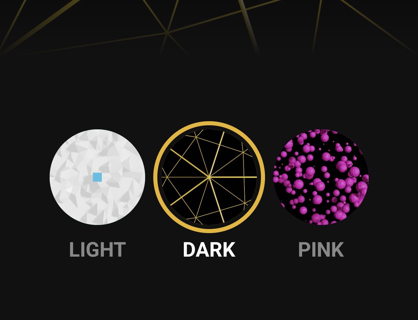
Jetpack Compose revamps the old way we used to handle themes in Android. It offers a lot of flexibility, which gives us more possibilities in our definition of how our UI looks. At the same time, the animation system in compose empowers us to create more ambitious and pleasant UI animations with ease. In this tutorial, I will combine these two to create an animation for switching between themes. The final result will look like this:

We will be using AnimatedContent to achieve this animation. This is a composable that takes in any object as a state and content to display. Whenever that state changes, it animates from the previous content to the new content using the new state. First, we need to define an object to pass in as a state that will contain all our current theme data.
data class CustomTheme(
    val primaryColor: Color,
    val background: Color,
    val textColor: Color,
    val image: Int,
)

val darkTheme = CustomTheme(
    primaryColor = Color(0xFFE9B518),
    background = Color(0xFF111111),
    textColor = Color(0xffFFFFFF),
    image = R.drawable.dark,
)

val lightTheme = CustomTheme(
    primaryColor = Color(0xFF2CB6DA),
    background = Color(0xFFF1F1F1),
    textColor = Color(0xff000000),
    image = R.drawable.light,
)

val pinkTheme = CustomTheme(
    primaryColor = Color(0xFFF01EE5),
    background = Color(0xFF110910),
    textColor = Color(0xFFEE8CE1),
    image = R.drawable.pink,
)
Here, I have defined a data class and three themes with unique colors.
Now we can implement AnimatedContent and use this object as the state.
@ExperimentalAnimationApi
@Composable
fun App() {
    var theme by remember { mutableStateOf(lightTheme) }
    AnimatedContent(
        targetState = theme,
        modifier = Modifier
			.background(Color.Black)
            .fillMaxSize(),
    ) { currentTheme ->
        Surface(
            modifier = Modifier
				.fillMaxSize(),
            color = currentTheme.background
	) {
            Box {
                Box(
                    modifier = Modifier
						.fillMaxWidth()
                        .height(300.dp)
                ) {
                    Image(
                        painter = painterResource(id = currentTheme.image),
                        contentDescription = "headerImage",
                        contentScale = ContentScale.Crop,
                    )
                    Box(
                        modifier = Modifier
							.fillMaxSize()
                            .background(
                                brush = Brush.verticalGradient(
                                    colors = listOf(
                                        Color.Transparent,
                                        currentTheme.background.copy(alpha = .2f),
                                        currentTheme.background
									)
                                )
                            )
                    )
                }

                Row(
                    modifier = Modifier
						.align(Alignment.Center),
                    horizontalArrangement = Arrangement.Center,
                    verticalAlignment = Alignment.CenterVertically,
                ) {

                    ThemeButton(
                        theme = lightTheme,
                        currentTheme = currentTheme,
                        text = "Light",
                    ) {
                        theme = lightTheme
					}

                    ThemeButton(
                        theme = darkTheme,
                        currentTheme = currentTheme,
                        text = "Dark",
                    ) {
                        theme = darkTheme
					}

                    ThemeButton(
                        theme = pinkTheme,
                        currentTheme = currentTheme,
                        text = "Pink",
                    ) {
                        theme = pinkTheme
					}
                }
            }
        }
    }
}
The state theme has been initialized and passed in to AnimatedContent. Inside the content, currentTheme is passed in to be used to theme our UI. Note, we should use this and not theme so that the previous content does not instantly switch to the new theme when the state changes. There is a simple UI defined with a header image and three buttons to switch between the available themes. At this point, we would have an animation looking like this:
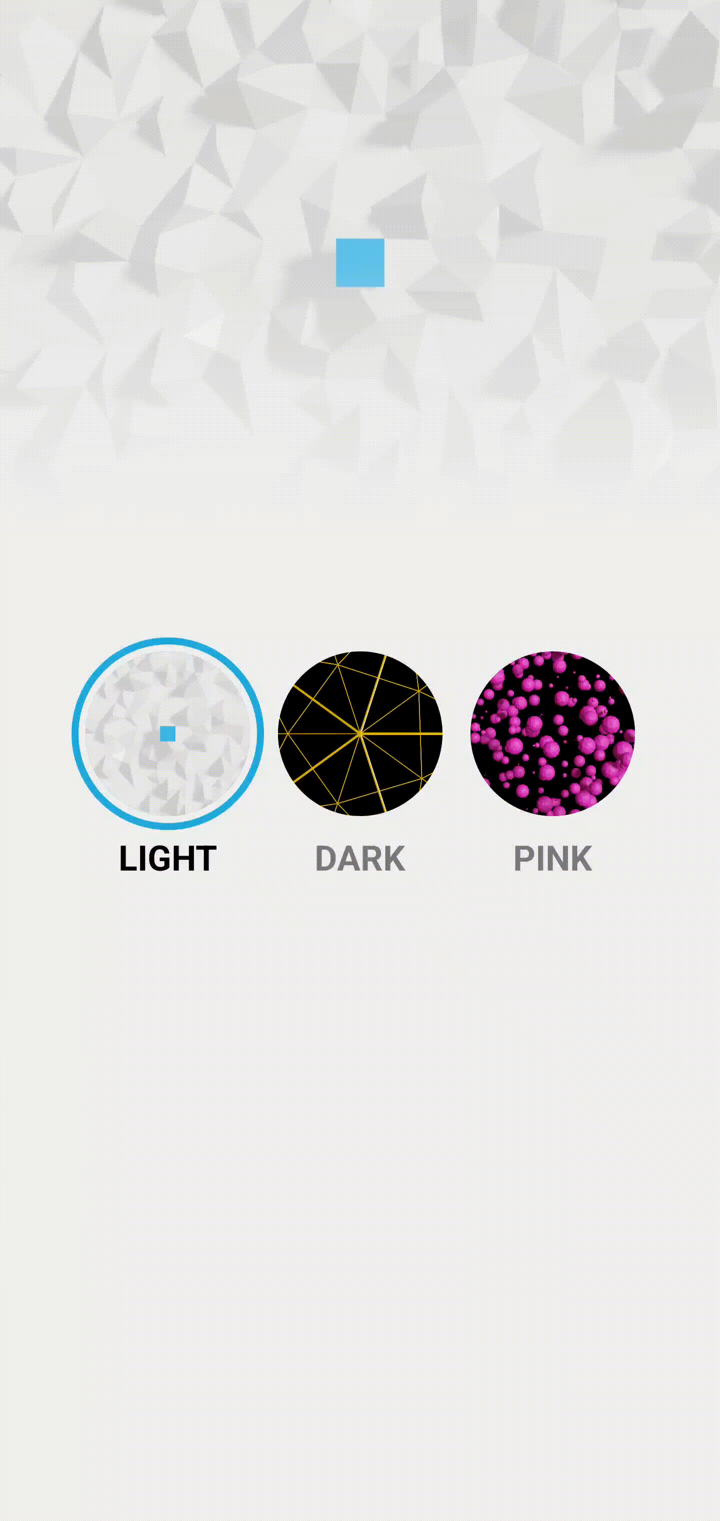
This is the default animation that comes with AnimatedContent. It's alright, but we need to change this in order to achieve the circle reveal animation in the final animation.
transitionSpec = {
    fadeIn(
        initialAlpha = 0f,
        animationSpec = tween(100)
    ) with fadeOut(
        targetAlpha = .9f,
        animationSpec = tween(800)
    ) + scaleOut(
        targetScale = .95f,
        animationSpec = tween(800)
    )
}
This is the custom animation we need to pass into AnimatedContent. The new content will fade in almost instantly, while the old content has a subtle fade and scale over a longer time. The new content has a fast fade in so that we can start the reveal animation instantly. When changing states in AnimatedContent, the new content is a new composable, so it triggers its own LaunchedEffect. We will start the animation from here and use the value to animate a circular clip over the new content.
...
var theme by remember { mutableStateOf(pinkTheme) }
var animationOffset by remember { mutableStateOf(Offset(0f, 0f)) }
AnimatedContent(
    ...
) { currentTheme ->

    val revealSize = remember { Animatable(1f) }
    LaunchedEffect(key1 = "reveal", block = {
        if (animationOffset.x > 0f) {
            revealSize.snapTo(0f)
            revealSize.animateTo(1f, animationSpec = tween(800))
        } else {
            revealSize.snapTo(1f)
        }
    })

    Box(
        modifier = Modifier
			.fillMaxSize()
            .clip(CirclePath(revealSize.value, animationOffset))
    ) {
        Surface(
...
The animationOffset state defines where the origin point of the circle animation. This will be later set inside the ThemeButton. revealSize animates the circle that clips the new content. In LaunchedEffect we start the circle clip animation if we have a valid origin point. If not, it means this is the first recomposition when we just open this screen, so we just snap the animation to the end. Next, we wrap Surface with a box that clips it. Notice that the shape used is a custom one. The reason for this was that the default CircleShape is just a rounded rectangle with a high radius, and I could not achieve the desired look with it.
class CirclePath(private val progress: Float, private val origin: Offset = Offset(0f, 0f)) : Shape {
    override fun createOutline(
        size: Size,
        layoutDirection: LayoutDirection,
        density: Density
	): Outline {

        val center = Offset(
            x = size.center.x - ((size.center.x - origin.x) * (1f - progress)),
            y = size.center.y - ((size.center.y - origin.y) * (1f - progress)),
        )
        val radius = (sqrt(
            size.height * size.height + size.width * size.width
		) * .5f) * progress

		return Outline.Generic(
            Path().apply {
                addOval(
                    Rect(
                        center = center,
                        radius = radius,
                    )
                )
            }
        )
    }
}
The shape CirclePath takes in a float that defines the progress so far and an origin point of the animation. Both of these, and the size, are used to create a circle reveal animation that covers the entire content. The last thing to do would be to define the origin of the animation once a button is clicked. This value is in the ThemeButton and is passed up when a button is clicked.
@Composable
fun ThemeButton(
    theme: CustomTheme,
    currentTheme: CustomTheme,
    text: String,
    onClick: (Offset) -> Unit,
) {
    val isSelected = theme == currentTheme
	var offset: Offset = remember { Offset(0f, 0f) }
    Column(
        horizontalAlignment = Alignment.CenterHorizontally
	) {
        Box(
            modifier = Modifier
				.onGloballyPositioned {
                    offset = Offset(
                        x = it.positionInWindow().x + it.size.width / 2,
                        y = it.positionInWindow().y + it.size.height / 2
					)
                }
                .size(110.dp)
                .border(
                    4.dp,
                    color = if (isSelected) theme.primaryColor else Color.Transparent,
                    shape = CircleShape
				)
                .padding(8.dp)
                .background(color = theme.primaryColor, shape = CircleShape)
                .clip(CircleShape)
                .clickable {
                    onClick(offset)
                }
        ) {
            Image(
                modifier = Modifier.fillMaxSize(),
                painter = painterResource(id = theme.image),
                contentDescription = "themeImage",
                contentScale = ContentScale.Crop,
            )
        }

        Text(
            text = text.uppercase(),
            modifier = Modifier
				.alpha(if (isSelected) 1f else .5f)
                .padding(2.dp),
            color = currentTheme.textColor,
            fontWeight = FontWeight.Bold,
            fontSize = 20.sp
		)
    }
}
Here is the definition of ThemButton. As you can see, the center offset of the button is sent when clicked. We can then set this as the origin point of the circle reveal animation, like this:
ThemeButton(
    ...
) {
    animationOffset = it
	theme = lightTheme
}

ThemeButton(
    ...
) {
    animationOffset = it
	theme = darkTheme
}

ThemeButton(
    ...
) {
    animationOffset = it
	theme = pinkTheme
}
And that's it. We now have a custom theme picker animation that will definitley delight our users. The full source code is available here.
Thanks for reading and good luck!
Subscribe for UI recipes