Neumorphism in Jetpack Compose
Learn how to create a neumorphic UI style in Jetpack Compose
Neumorphism is a design style that utilizes soft shadows and highlights to give flat UI elements the slightest hint of depth. In this article, we shall create a neumorphic UI element.
Basics
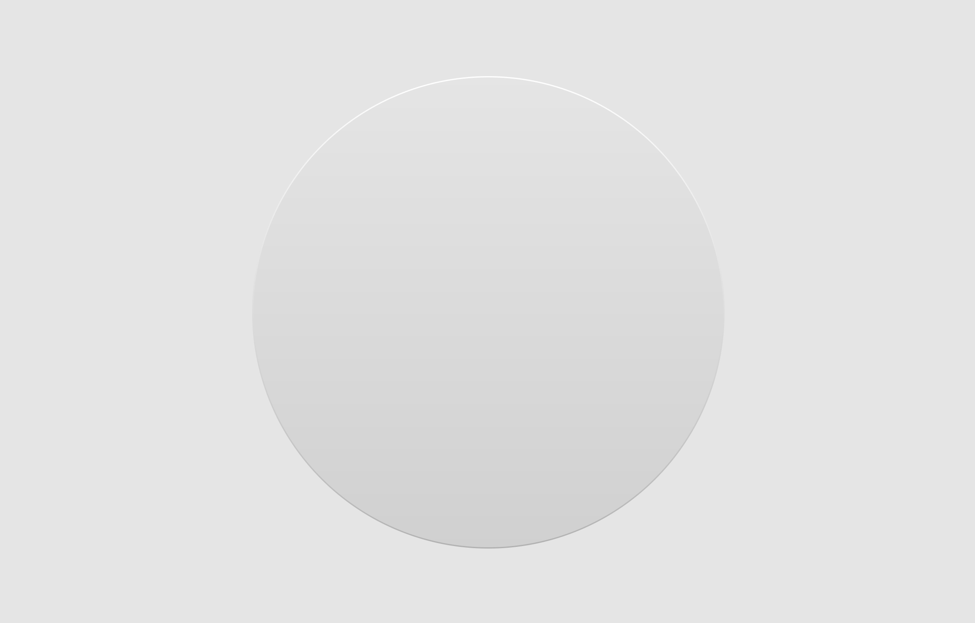
Let's first create a Box with a background.
val gray100 = Color(0xffe5e5e5)
val gray200 = Color(0xffd0d0d0)

Box(
    Modifier
        .weight(1f)
        .background(gray100)
        .fillMaxSize(),
    contentAlignment = Alignment.Center
) {
	Box(
	    Modifier
	        .fillMaxSize()
	        .background(
	            brush = Brush.verticalGradient(
				    colors = listOf(
				        gray100,
				        gray200,
				    )
				),
	            shape = CircleShape
	        )
	)
}
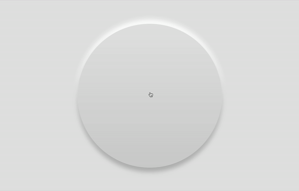
The code above will create a circle with a slight gradient from top to bottom. The gradient gives it the appearance that light is shining from above and lighting the top part of the circle.

Border
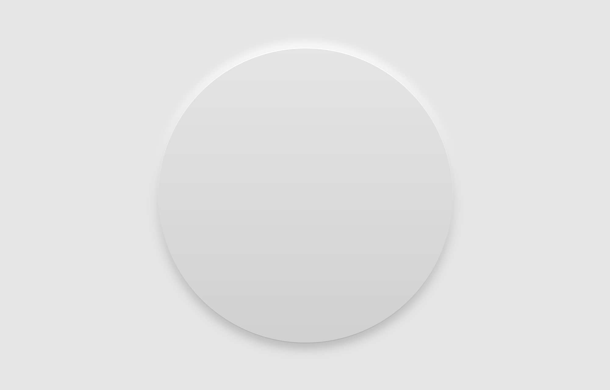
To add some more depth, let's give the circle a bevel along the edge. We can do this by adding a border.
Box(
    Modifier
        .fillMaxSize()
        .background(...)
        .border(
            width = 1.dp,
            shape = CircleShape,
            brush = Brush.verticalGradient(
                colors = listOf(
                    Color.White,
                    Color.Black.copy(alpha = .15f),
                )
            )
        )
)
We can adjust the width of the border to increase the size of the bevel. Here, I just put 1.dp. The shape must be the same shape we used for the background modifier; CircleShape.
For the color of the border, we will also use a vertical gradient, like the background, but using much more intense colors. Assuming this source of light is coming from above, the top bevel will reflect much more light, whereas the bottom bevel will receive the least amount of light.
That's why for this example, we use white and a lower opacity version of black as the gradient colors.
Depending on the desired look, you can also increase the width of the border to create a thicker bevel.

Shadows
Now, on to the shadows. Instead of using the shadow modifier for these, we will rather render blurred boxes below our circle. This is to maintain fine control over how the shadows look.
Box(
    Modifier
        .fillMaxSize()
        .offset { IntOffset(0, -20) }
        .blur(10.dp, edgeTreatment = BlurredEdgeTreatment.Unbounded)
        .background(Color.White, CircleShape)
)

Box(
    Modifier
        .fillMaxSize()
        .offset { IntOffset(0, 20) }
        .blur(10.dp, edgeTreatment = BlurredEdgeTreatment.Unbounded)
        .background(Color.Black.copy(alpha = .2f), CircleShape)
)

Box(
    Modifier
        .fillMaxSize()
        .background(...)
        .border(...)
)
With the code above, we now have a shadow on the bottom area where the light is blocked, and also a lighter "shadow" at the top which replicates the light reflecting off the top surface.
As you can see, we are manually manipulating the offsets of the shadows and the blurs. This control really comes in handy when defining animations for these elements.
For example, if we want to animate the element to be pushed down as the user presses on it, we can animate the offset and the blur of the shadow. This is to mimic real life shadows which get sharper as an object is closer to the surface where its shadow falls on.
val offset by animateIntAsState(targetValue = if (pressed) 5 else 30)
val blur by animateDpAsState(targetValue = if (pressed) 4.dp else 10.dp)

Box(
    Modifier
        .fillMaxSize()
        .offset { IntOffset(0, -offset) }
        .blur(blur, edgeTreatment = BlurredEdgeTreatment.Unbounded)
        .background(Color.White, CircleShape)
)

Box(
    Modifier
        .fillMaxSize()
        .offset { IntOffset(0, offset) }
        .blur(blur, edgeTreatment = BlurredEdgeTreatment.Unbounded)
        .background(Color.Black.copy(alpha = .2f), CircleShape)
)
Conclusion
This has been just the basics of building a neumorphic interface. But with these building blocks, and a little more time, you can create much more complex versions.
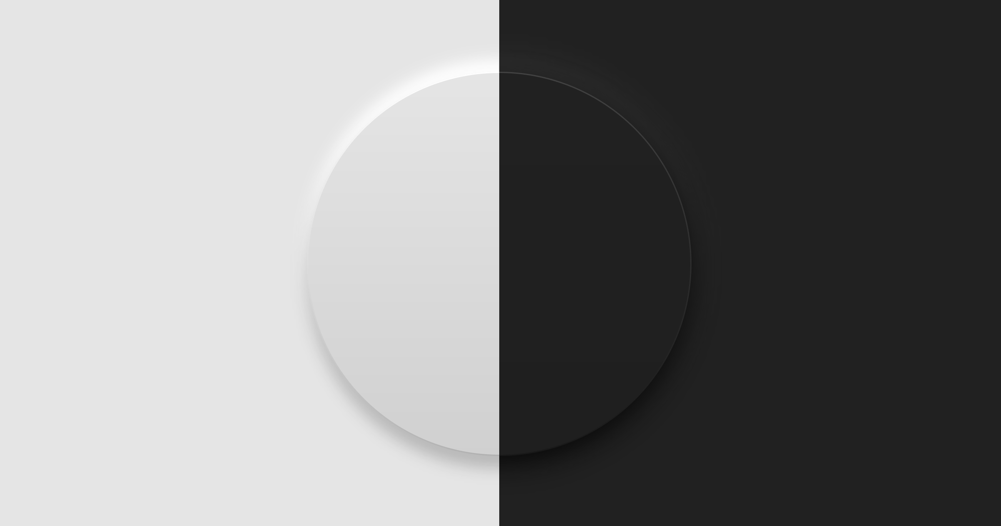
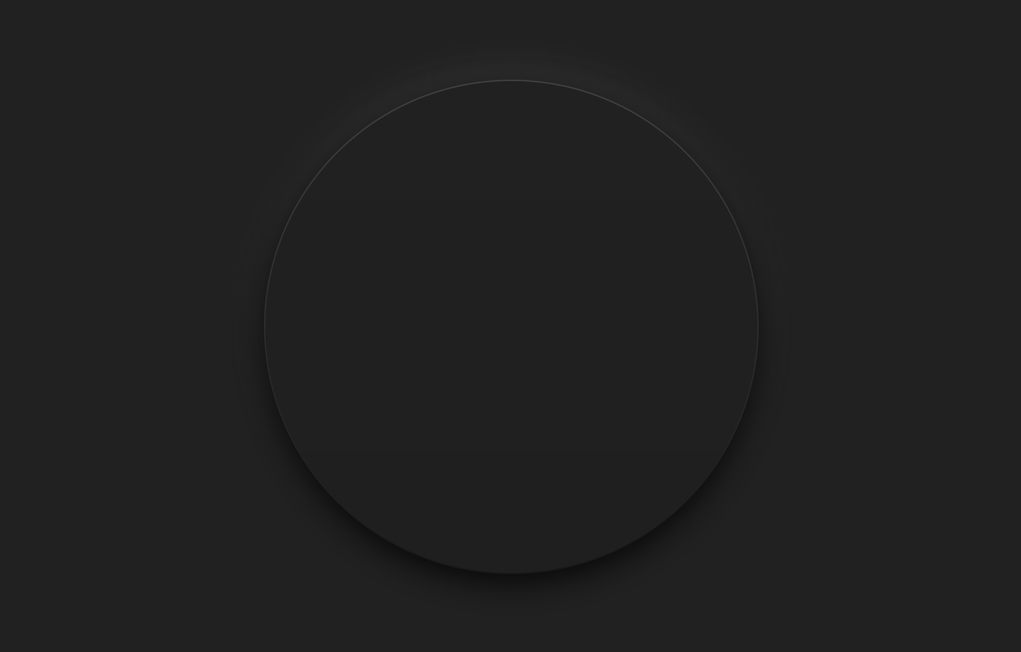
How about a dark mode version?
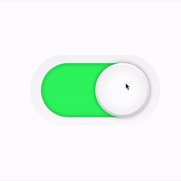
Or a Switch UI element?
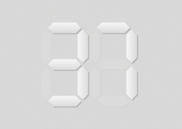
Or an LED display?
Let me know what you build using this design style.
Thanks for reading and good luck!
Subscribe for UI recipes