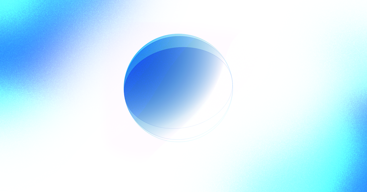
Loading Animation on Android (in XML)
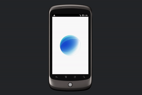
Build this fancy loading animation for your android app
In this quick article, we shall be going over how to create this animation.
We shall create it as a custom view with attributes which we can tweak for any color our design needs. Let's get into it.
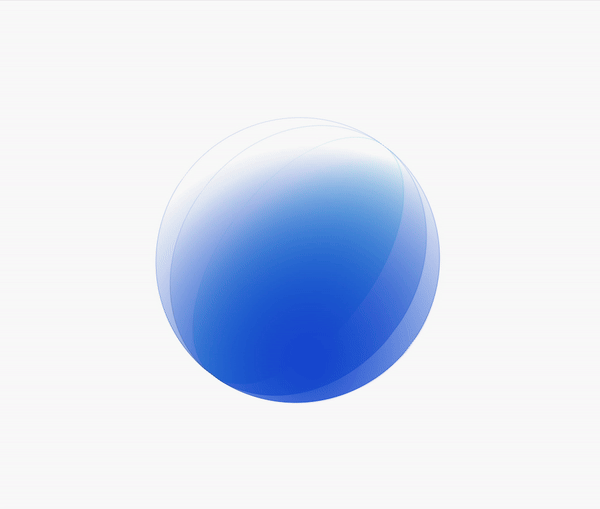
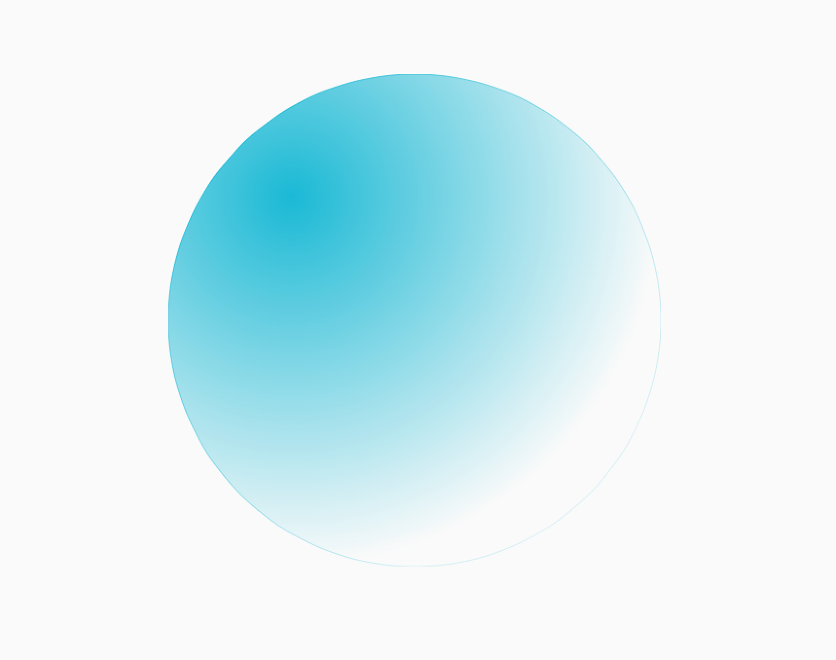
One Circle
Let's first create the GradientCircle, which is one single circle in the animation. We will later create three of these for the final animation.
public class GradientCircle extends View {
    public GradientCircle(Context context) {
        super(context);
    }
}
Here we have created the GradientCircle by extending View and adding a constructor. We shall be only using this constructor for initialization within code.
Next, let's create the variables we will need for this view.
public class GradientCircle extends View {
	Paint paint = new Paint();
	Paint outlinePaint = new Paint();

	int length = 0;
	int width = 0;
	int height = 0;

	int color = Color.BLACK;

	...

}
We have initialized two paint objects, one for the fill of the circle, and the other for the outline paint. Next we create some variables to keep track of the size of the view. And finally the color will be used to set the color of the two paint objects.
To set the width, height and length, we override the onSizeChanged() method.
@Override
protected void onSizeChanged(int w, int h, int oldw, int oldh) {
    super.onSizeChanged(w, h, oldw, oldh);
    width = w;
    height = h;
    length = Math.min(w, h);

    setGradient(color);
}
After setting the dimensions, we shall upgrade the paint gradients so that the gradients match the layout's size. The setGradient() method is defined as follows:
public void setGradient(int color) {
    if (length > 0) {
        RadialGradient gradient = new RadialGradient(
                length * .25f,
                length * .25f,
                length * .75f,
                color,
                Color.TRANSPARENT,
                android.graphics.Shader.TileMode.CLAMP
        );
        paint.setDither(true);
        paint.setShader(gradient);

        RadialGradient outlineGradient = new RadialGradient(
                length * .25f,
                length * .25f,
                length,
                color,
                Color.TRANSPARENT,
                android.graphics.Shader.TileMode.CLAMP
        );
        outlinePaint.setStyle(Paint.Style.STROKE);
        outlinePaint.setStrokeWidth(1f);
        outlinePaint.setDither(true);
        outlinePaint.setShader(outlineGradient);
    }
}
This creates a RadialGradient that calculates its center and radius based on the length and sets it as the shader of its respective paint. object. Only difference for the two is that we set the stroke style and width for the outlinePaint.
We already update the paint objects when the size changes, but we also need to update them when we change the color.
public void setColor(int color) {
    this.color = color;
    setGradient(this.color);
}
Finally, we have to draw the circle itself by overriding the onDraw method
@Override
protected void onDraw(@NonNull Canvas canvas) {
    super.onDraw(canvas);
    canvas.drawCircle(width / 2f, height / 2f, length / 2f, paint);
    canvas.drawCircle(width / 2f, height / 2f, length / 2f, outlinePaint);
}
Here we draw the filled circle and the outlined circle with the same center and radius.
Bring it all together
Now let's create a LoadingGradientSpinner view that will contain three gradient circles and animate them accordingly. This is what we will be able to call in our XML layout.
Let's create the view and pull data defined in the xml layout.
First, we create a values/attrs.xml file to define what we the data we need.
<resources>
    <declare-styleable name="LoadingGradientSpinner">
        <attr name="firstColor" format="color" />
        <attr name="secondColor" format="color" />
        <attr name="thirdColor" format="color" />
    </declare-styleable>
</resources>
Next, we create the class itself, and extract the data defined here.
public class LoadingGradientSpinner extends FrameLayout {

    GradientCircle firstCircle;
    GradientCircle secondCircle;
    GradientCircle thirdCircle;

    public LoadingGradientSpinner(Context context) {
        super(context);
    }

    public LoadingGradientSpinner(Context context, @Nullable AttributeSet attrs) {
        super(context, attrs);

        TypedArray attributes = context.getTheme().obtainStyledAttributes(
                attrs,
                R.styleable.LoadingGradientSpinner,
                0, 0);
        try {
            init(
                    attributes.getColor(R.styleable.LoadingGradientSpinner_firstColor, 0),
                    attributes.getColor(R.styleable.LoadingGradientSpinner_secondColor, 0),
                    attributes.getColor(R.styleable.LoadingGradientSpinner_thirdColor, 0)
            );
        } finally {
            attributes.recycle();
        }
    }
...

}
Now we can use the view in our xml like so:
<com.sinasamaki.aprilapp.LoadingGradientSpinner
    android:layout_width="200dp"
    android:layout_height="200dp"
    android:padding="8dp"
    app:firstColor="#1AB9D5"
    app:layout_constraintBottom_toBottomOf="parent"
    app:layout_constraintEnd_toEndOf="parent"
    app:layout_constraintStart_toStartOf="parent"
    app:layout_constraintTop_toTopOf="parent"
    app:secondColor="#1A74D5"
    app:thirdColor="#1A4FD5" />
With all the boilerplate out of the way, we can now define the init method. This takes in the three colors we had defined in the XML and creates three GradientCircles.
private void init(
        int firstColor,
        int secondColor,
        int thirdColor
) {
    firstCircle = new GradientCircle(getContext());
    secondCircle = new GradientCircle(getContext());
    thirdCircle = new GradientCircle(getContext());

    addView(firstCircle);
    addView(secondCircle);
    addView(thirdCircle);

    firstCircle.setColor(firstColor);
    secondCircle.setColor(secondColor);
    thirdCircle.setColor(thirdColor);

	...

}
Here we initialize the three circles, add them to the view and set their colors.
Next, let's animate the individual circles.
firstCircle.setCameraDistance(100000);
secondCircle.setCameraDistance(100000);
thirdCircle.setCameraDistance(100000);

ObjectAnimator firstCircleAnimation = createCircleAnimation(firstCircle, 0L);
firstCircleAnimation.start();

ObjectAnimator secondCircleAnimation = createCircleAnimation(secondCircle, 200L);
secondCircleAnimation.start();

ObjectAnimator thirdCircleAnimation = createCircleAnimation(thirdCircle, 400L);
thirdCircleAnimation.start();
Note that I increased their camera distance to minimize clipping while rotating around the x-axis. And then we use a helper method, createCircleAnimation, to create the animation before running it. The helper method is defined as:
private ObjectAnimator createCircleAnimation(View circle, long delay) {
    ObjectAnimator animation = ObjectAnimator.ofFloat(circle, View.ROTATION_X, 0f, 360f);
    animation.setRepeatCount(ValueAnimator.INFINITE);
    animation.setRepeatMode(ValueAnimator.RESTART);
    animation.setDuration(3_000L);
    animation.setStartDelay(delay);
    animation.setInterpolator(new LinearInterpolator());
    return animation;
}
And finally, we rotate the entire view slowly around the z-axis to make it a little more dynamic.
ObjectAnimator viewRotate = ObjectAnimator.ofFloat(this, View.ROTATION, 0f, 360f);
viewRotate.setRepeatCount(ValueAnimator.INFINITE);
viewRotate.setRepeatMode(ValueAnimator.RESTART);
viewRotate.setDuration(20_000L);
viewRotate.start();
Finally, we have this loading animation.
Click here for the complete project.
Conclusion ;)
This was a fun article to work on. It took me way back to my early days of coding and has made me appreciate how far Android has come. I hope you enjoyed it too. Happy 1st of April!
Just keep in mind, it does not matter what UI system, language or pattern you are using. Always strive to make beautiful stuff and the tech will fall in place.
Thanks for reading and good luck!
Alternative Solution
@Composable
fun LoadingSpinner(modifier: Modifier = Modifier) {
    val animation = rememberInfiniteTransition()
    val rotation = animation.animateFloat(
        initialValue = 0f,
        targetValue = 360f,
        animationSpec = infiniteRepeatable(
            animation = tween(durationMillis = 20_000)
        ), label = "rotation"
    )
    Box(modifier = modifier.graphicsLayer { rotationZ = rotation.value }) {
        GradientCircle(color = Color(0xff1AB9D5))
        GradientCircle(color = Color(0xff1A74D5), delay = 200)
        GradientCircle(color = Color(0xff1A4FD5), delay = 400)
    }
}

@Composable
fun GradientCircle(
    modifier: Modifier = Modifier,
    color: Color,
    delay: Int = 0,
) {
    val animation = rememberInfiniteTransition()
    val rotation = animation.animateFloat(
        initialValue = 0f,
        targetValue = 360f,
        animationSpec = infiniteRepeatable(
            animation = tween(durationMillis = 3_000, easing = LinearEasing),
            initialStartOffset = StartOffset(delay)
        ), label = "gradientCircleRotation"
    )
    Box(
        modifier = modifier
            .graphicsLayer { rotationX = rotation.value; cameraDistance = 100000f }
            .fillMaxSize()
            .drawBehind {
                drawCircle(
                    brush = Brush.radialGradient(
                        colors = listOf(color, Color.Transparent),
                        center = Offset.Zero,
                        radius = size.width,
                    )
                )
                drawCircle(
                    brush = Brush.radialGradient(
                        colors = listOf(color, Color.Transparent),
                        center = Offset.Zero,
                        radius = size.width * 1.5f,
                    ),
                    style = Stroke(width = 1f)
                )
            }
    )
}
Subscribe for UI recipes