Glassmorphic Bottom Navigation in Jetpack Compose
Implement a frosty bottom bar using Haze library
In this article, we will create a bottom navigation bar in a glassmorphic design style. We will do this using the new Haze library by Chris Banes. This library enables us to easily blur the backdrop of a Composable, meaning anything behind the element will be visible, but blurry.
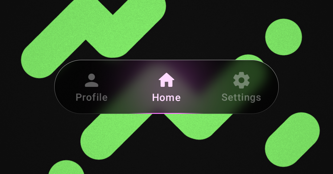
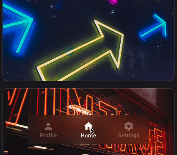
In the end, we will build a bottom navigation bar looking like this:
Setup
First let us create a basic layout to apply our frosty bottom navigation bar. We will use a Scaffold to place our main content and bottom bar on screen like so:
Scaffold(
        bottomBar = { /* BOTTOM NAVIGATION BAR */ }
    ) { padding ->
        LazyColumn(
            Modifier.fillMaxSize(),
            contentPadding = padding
        ) {
            items(50) {
                // IMAGE CARDS
            }
        }
    }
Note that we are using the padding provided by the Scaffold as contentPadding and not as a padding modifier. This is to make the content to take up the entire screen and the bottom navigation (or Top App Bar, if present) will go over the content.
But when we reach the ends of the list, enough space is left for our navigation bars.
As for the bottom bar implementation, let's create some sample tabs to display.
sealed class BottomBarTab(val title: String, val icon: ImageVector, val color: Color) {
    data object Profile : BottomBarTab(
        title = "Profile",
        icon = Icons.Rounded.Person,
        color = Color(0xFFFFA574)
    )
    data object Home : BottomBarTab(
        title = "Home",
        icon = Icons.Rounded.Home,
        color = Color(0xFFFA6FFF)
    )
    data object Settings : BottomBarTab(
        title = "Settings",
        icon = Icons.Rounded.Settings,
        color = Color(0xFFADFF64)
    )
}

val tabs = listOf(
    BottomBarTab.Profile,
    BottomBarTab.Home,
    BottomBarTab.Settings,
)
The BottomBarTab sealed class defines some tabs that have some basic info about the tab. Each tab has it's own title, tab icon and unique color for when it is selected.
With these sample tabs, let's simulate switching between them. For this we will use an int state that we change when a tab is clicked.
var selectedTabIndex by remember { mutableIntStateOf(1) }
Box(
	modifier = Modifier
		.padding(vertical = 24.dp, horizontal = 64.dp)
		.fillMaxWidth()
		.height(64.dp)
) {
	BottomBarTabs(
		tabs,
		selectedTab = selectedTabIndex,
		onTabSelected = {
			selectedTabIndex = tabs.indexOf(it)
		}
	)
}
Let's now bring all this together and render the bottom bar inside BottomBarTabs:
@Composable
fun BottomBarTabs(
    tabs: List<BottomBarTab>,
    selectedTab: Int,
    onTabSelected: (BottomBarTab) -> Unit,
) {
    CompositionLocalProvider(
        LocalTextStyle provides LocalTextStyle.current.copy(
            fontSize = 12.sp,
            fontWeight = FontWeight.Medium,
        ),
        LocalContentColor provides Color.White
    ) {
        Row(
            modifier = Modifier.fillMaxSize(),
        ) {
            for (tab in tabs) {
                val alpha by animateFloatAsState(
                    targetValue = if (selectedTab == tabs.indexOf(tab)) 1f else .35f,
                    label = "alpha"
                )
                val scale by animateFloatAsState(
                    targetValue = if (selectedTab == tabs.indexOf(tab)) 1f else .98f,
                    visibilityThreshold = .000001f,
                    animationSpec = spring(
                        stiffness = Spring.StiffnessLow,
                        dampingRatio = Spring.DampingRatioMediumBouncy,
                    ),
                    label = "scale"
                )
                Column(
                    modifier = Modifier
                        .scale(scale)
                        .alpha(alpha)
                        .fillMaxHeight()
                        .weight(1f)
                        .pointerInput(Unit) {
                            detectTapGestures {
                                onTabSelected(tab)
                            }
                        },
                    horizontalAlignment = Alignment.CenterHorizontally,
                    verticalArrangement = Arrangement.Center,
                ) {
                    Icon(imageVector = tab.icon, contentDescription = "tab ${tab.title}")
                    Text(text = tab.title)
                }
            }
        }
    }
}
Here, we loop through all the tabs and render them in a Row using the title and icon that we defined earlier. We also added some basic animation for switching tabs.
There is an alpha animation that fades inactive tabs and a scale animation, giving the tab selection a little motion.
Now that we have the setup, let's move on to creating the glassy effect.
Haze Library
Include the Haze library in the project and make sure the version is 0.4.1 or above.
dependencies {
	implementation("dev.chrisbanes.haze:haze-jetpack-compose:0.4.1")
}
To achieve the blurry effect, we have to tell Haze which Composable to blur and which Composable causes and positions that blur. We do this using haze and hazeChild modifiers, respectively. And we will connect them using a hazeState.
val hazeState = remember { HazeState() }
In our case, the Composable we want to blur is the LazyColumn. So let's add the haze modifier on it.
LazyColumn(
    Modifier
        .haze(
            hazeState,
            backgroundColor = MaterialTheme.colorScheme.background,
            tint = Color.Black.copy(alpha = .2f),
            blurRadius = 30.dp,
        )
        .fillMaxSize(),
    contentPadding = padding
) { ... }
In the haze modifier, after passing in the hazeState, I have also passed in some values that worked for me. But you could experiment further with this to create a unique effect.
As for the hazeChild modifier, we will apply that to the bottom navigation
Box(
	modifier = Modifier
		.padding(vertical = 24.dp, horizontal = 64.dp)
		.fillMaxWidth()
		.height(64.dp)
		.hazeChild(state = hazeState)
    ) {
        BottomBarTabs(...)
    }
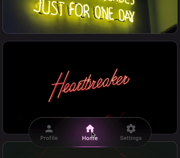
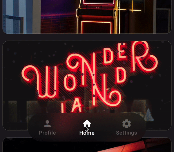
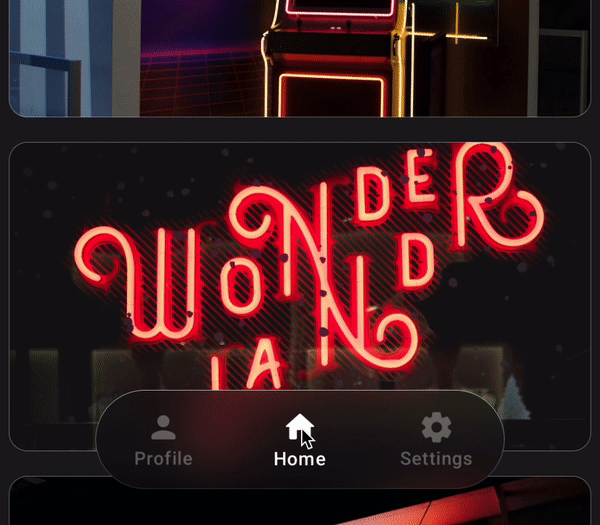
We apply the modifier and pass in the same hazeState that was out in the LazyColumn. This gives us this result.
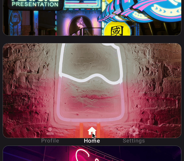
This looks good, but we would like a rounded shape for the blurry area. Luckily, Haze library allows us to pass in a shape to define the boundary of the area to be blurred.
.hazeChild(state = hazeState, shape = CircleShape)
And now we have a nicely rounded, blurry shape for our bottom navigation.
The Details
What we have so far looks okay, but we can add some more details that will take it to the next level. This first change is a simple one, but it will drastically improves the look of our bottom navigation.
Let's add a border around the blurry area.
.hazeChild(state = hazeState, shape = CircleShape)
.border(
    width = Dp.Hairline,
    brush = Brush.verticalGradient(
        colors = listOf(
            Color.White.copy(alpha = .8f),
            Color.White.copy(alpha = .2f),
        ),
    ),
    shape = CircleShape
)
Doing this gives the element some sense of order. And to go with the glassy aesthetic, we did not just add a solid border, but a gradient that mimics light falling on the top of the element.
Next, we shall add some animation as a tab is selected.
Let's first implement some animation values. We will animate the selected tab index and the tab color that we setup earlier.
BottomBarTabs(...)

val animatedSelectedTabIndex by animateFloatAsState(
    targetValue = selectedTabIndex.toFloat(),
    label = "animatedSelectedTabIndex",
    animationSpec = spring(
        stiffness = Spring.StiffnessLow,
        dampingRatio = Spring.DampingRatioLowBouncy,
    )
)

val animatedColor by animateColorAsState(
    targetValue = tabs[selectedTabIndex].color,
    label = "animatedColor",
    animationSpec = spring(
        stiffness = Spring.StiffnessLow,
    )
)
With these values, let's add a glow that animates over the currently selected tab and animates its glow color to the respective tab color.
Canvas(
    modifier = Modifier
        .fillMaxSize()
        .clip(CircleShape)
        .blur(50.dp, edgeTreatment = BlurredEdgeTreatment.Unbounded)
) {
    val tabWidth = size.width / tabs.size
    drawCircle(
        color = animatedColor.copy(alpha = .6f),
        radius = size.height / 2,
        center = Offset(
            (tabWidth * animatedSelectedTabIndex) + tabWidth / 2,
            size.height / 2
        )
    )
}
We accomplish this using a Canvas in which we draw a circle whose center is the center of the current tab. This Canvas is the exact same size as the bottom navigation, so we can divide it equally, and animate to the selected tab using animatedSelectedTabIndex.
The color of the circle is a variant of animatedColor with a lower opacity.
And finally, we blur the entire canvas and clip it so that the blur does not fall on the content below.
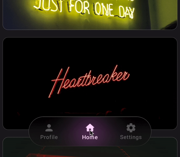
The last detail, is a gleam on the bottom side of the bottom navigation. This simulates the indicator glow reflecting off the bottom bevel of our glassy Composable. We will do this with a clipped Canvas too, but without the blur.
Canvas(
    modifier = Modifier
        .fillMaxSize()
        .clip(CircleShape)
) {
    val path = Path().apply {
        addRoundRect(RoundRect(size.toRect(), CornerRadius(size.height)))
    }
    val length = PathMeasure().apply { setPath(path, false) }.length

    val tabWidth = size.width / tabs.size
    drawPath(
        path,
        brush = Brush.horizontalGradient(
            colors = listOf(
                animatedColor.copy(alpha = 0f),
                animatedColor.copy(alpha = 1f),
                animatedColor.copy(alpha = 1f),
                animatedColor.copy(alpha = 0f),
            ),
            startX = tabWidth * animatedSelectedTabIndex,
            endX = tabWidth * (animatedSelectedTabIndex + 1),
        ),
        style = Stroke(
            width = 6f,
            pathEffect = PathEffect.dashPathEffect(
                intervals = floatArrayOf(length / 2, length)
            )
        )
    )
}
In the Canvas, we create a rounded rectangle path that goes around the bottom navigation, and then we measure its length.
Once we have the path defined, we draw it with a gradient of the animatedColor. This gradient is positioned to start at the left edge of the currently selected tab and ends on its right edge. This is calculated using animatedSelectedTabIndex, so it will smoothly animate along with the glow.
Finally, we add a dashPathEffect that draws only the bottom half of the path.
And with that, we have this delightful bottom navigation animation

Full code available here.
This is only the beginning of what we can accomplish with this glassmorphic UI. I hope this article has taught and inspired you to go further.
Thanks for reading and good luck!
Subscribe for UI recipes