Extending SwipeToDismiss in Jetpack compose

This is a common UI pattern to perform quick actions on lists of items. In this article, we will go over how to build a rich, expressive swipe to dismiss example.
Jetpack compose has a default composable that provides this functionality called SwipeToDismiss. This composable offers some customization but we can improve it to create a better experience for the user.
Please note: This article is not an introduction and assumes some knowledge of the SwipeToDismiss composable and jetpack compose in general. For a quick intro to the SwipeToDismiss composable, refer to this tutorial by Pankaj Rai.
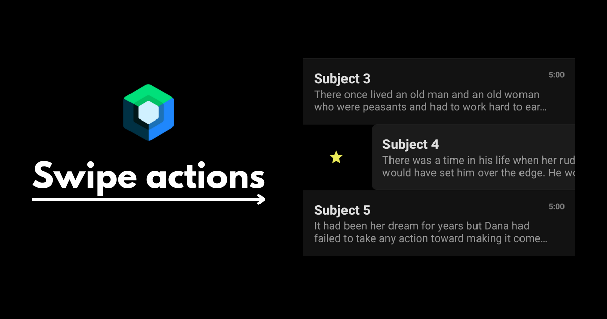
Here is how the finished composable looks like:
There are 3 areas we will improve on in this article:
- Customizability
- Expressiveness
- Discoverability
1. Customizability
First we need to extend the capabilities of the default SwipeDismiss composable so that we can build a better and more custom experience. To accomplish this, we will create a config object to define different options for our composable.
data class SwipeActionsConfig(
    val threshold: Float,
    val icon: ImageVector,
    val iconTint: Color,
    val background: Color,
    val stayDismissed: Boolean,
    val onDismiss: () -> Unit,
)
The composable will take in up to two config objects that define the behaviors for swiping from the start and end. These customizable options are:
threshold
This a float between 0 and 1 that defines how far a swipe gesture has to travel before triggering an action. The default composable already provides this functionality but the reason for making a custom solution is to expose it in the state. The default SwipeToDismiss composable already allows for this option but we will handle it manually in order to expose it as a state to be used in our UI. But first, to avoid any bugs caused by inconsistencies with the default composable, we need to pass this threshold value to the default composable.
SwipeToDismiss(
    ...
    dismissThresholds = {
        if (it == DismissDirection.StartToEnd)
            FractionalThreshold(startDismissConfig.threshold)
        else FractionalThreshold(endDismissConfig.threshold)
    },
    ...
}
With that out of the way, we will now create a willDismissDirection state that we can use to know if a user's current swipe will cause an action.
var willDismissDirection: DismissDirection? by remember {
    mutableStateOf(null)
}
This will contain the direction of the action that the user is about to trigger, or null if the user has not reached the threshold.
LaunchedEffect(key1 = Unit, block = {
    snapshotFlow { state.offset.value }
        .collect {
            willDismissDirection = when {
                it > width * startActionsConfig.threshold -> DismissDirection.StartToEnd
                it < -width * endActionsConfig.threshold -> DismissDirection.EndToStart
                else -> null
            }
        }
})
This will allow us later on to change the UI based on the current position and state of the swipe.
colors & icons
This one is simple, we will just define the colors and icons for each side. For the colors, we will define a background color and an icon tint color. Note: Just to keep it simple, I chose to pass in a vector icon. But this can be taken even further by passing in a composable for the icon. This allows you to do even cooler designs like animating icons.
stayDismissed
In different scenarios, once a swipe action is triggered, we would want the list item to either animate all the way(ex. deleting an item from current list) or bounce back to its default state(ex. adding an item to a different curated list). With this option, we can define per action which of the two behaviors we would like. To achieve this, we just need to implement the confirmStateChange function in the dismissState.
val state = rememberDismissState(
    confirmStateChange = {
        // return true for the item to stay dismissed
        // return false for the item to bounce back to its default state
    }
)
onDismiss
This is the function that will be called, once the user has swiped passed the threshold. This is also achieved within the confirmStateChange function. We should first check if our willDismissDirection state corresponds to the direction passed into the function. If so, we call the onDismiss function and then we return the stayDissmised boolean.
val state = rememberDismissState(
    confirmStateChange = {
        if (willDismissDirection == DismissDirection.StartToEnd
            && it == DismissValue.DismissedToEnd
        ) {
            startActionsConfig.onDismiss()
            startActionsConfig.stayDismissed
        } else if (willDismissDirection == DismissDirection.EndToStart &&
            it == DismissValue.DismissedToStart
        ) {
            endActionsConfig.onDismiss()
            endActionsConfig.stayDismissed
        } else {
            false
        }
    }
)
2. Expressiveness
Most important message we need to communicate is whether the user's action will trigger an action and what that action will be. We can use this opportunity and be creative with the delivery of this message. Since we exposed the threshold as a state earlier, we can use willDismissDirection here to animate and provide feedback as to when an action will be triggered.
reveal animation
To add some visual flair, I am inverting the colors of the icon and it's background here using a circle reveal animation. I use the AnimatedContent composable and pass the direction of the action and whether or not it will trigger an action as the target state.
AnimatedContent(
    targetState = Pair(state.dismissDirection, willDismissDirection != null),
    transitionSpec = {...}
) { (direction, willDismiss) ->
	// SwipeToDismiss composable implementation
}
Icon animation
On top of the reveal animation, I also added a bounce animation to the icon. For this, I also listen to the willDismiss boolean inside the AnimatedContentcomposable and I animate if true.
LaunchedEffect(key1 = Unit, block = {
    if (willDismiss) {
        revealSize.snapTo(0f)
        launch {
            revealSize.animateTo(1f, animationSpec = tween(400))
        }
        iconSize.snapTo(.8f)
        iconSize.animateTo(
            1.45f,
            spring(
                dampingRatio = Spring.DampingRatioHighBouncy,
            )
        )
        iconSize.animateTo(
            1f,
            spring(
                dampingRatio = Spring.DampingRatioLowBouncy,
            )
        )
    }
})
Haptic feedback
This one is the easiest to implement but does a lot to provide useful feedback to the user. We can listen to the willDismissDirection state and vibrate the device if an action will be triggered.
val haptic = LocalHapticFeedback.current
LaunchedEffect(key1 = willDismissDirection, block = {
    if (willDismissDirection != null) {
        haptic.performHapticFeedback(HapticFeedbackType.LongPress)
    }
})
3. Discoverability
After carefully crafting this beautiful interaction, it would be a shame if the user never knows it even exists. Most apps suggest to the user that this interaction is possible by animating the list item a little and revealing the icon indicating the action underneath. But how do we do this in our composable? We can add another argument in our composable to determine if a list item should be used as a "tutorial" for the user. This can be the first item or a dummy item we inject into the list. If this is true, we define an animation to run infinitely as a hint to the user that this list item can be swiped.
var showingTutorial by remember {
    mutableStateOf(showTutorial)
}

if (showingTutorial) {
    val infiniteTransition = rememberInfiniteTransition()
    val x by infiniteTransition.animateFloat(
        initialValue = 0f,
        targetValue = width * (startActionsConfig.threshold) / 2f,
        animationSpec = infiniteRepeatable(
            animation = tween(500, easing = FastOutSlowInEasing, delayMillis = 1000),
            repeatMode = RepeatMode.Reverse
        )
    )

    LaunchedEffect(key1 = x, block = {
        state.performDrag(x - state.offset.value)
    })
}
Once the user attempts the action, we cancel the animation so that there is no weird behavior of the animation running while the user is trying to perform the swipe. We can do this by setting the showingTutorial variable as false.
SwipeToDismiss(
    state = state,
    modifier = Modifier
        .pointerInteropFilter {
            if (it.action == MotionEvent.ACTION_DOWN) {
                showingTutorial = false
            }
            false
        },
        ...
)
This is how the final tutorial animation looks like:
Full sample project is available here on Github.
Thanks for reading and good luck!
Subscribe for UI recipes