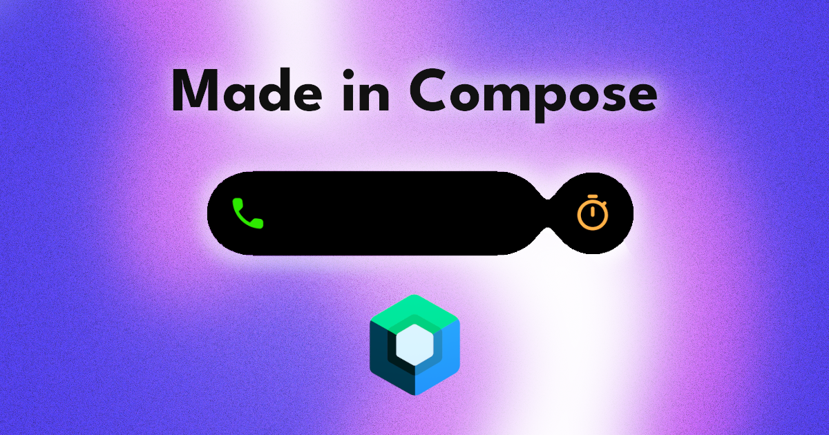
Made in Compose - Dynamic Island
Recreating the dynamic island animation from the new iPhone 14 Pro in Jetpack Compose.
Welcome to my Made in Compose series where I attempt recreating UI and animations in Jetpack Compose and share my process.
In this post, I will be recreating the dynamic island animation from the new iPhone 14 Pros.
I hate to give it to them but Apple did a good job making a display cutout, that has been present in many devices recently, so captivating just with the power of UI animations.
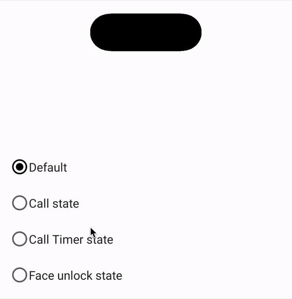
Here is my process to recreating 4 of the dynamic island states in Jetpack Compose:
Default state
At rest, the dynamic island is a pill shape at the top of the screen. This is the easiest state to recreate since there are no animations and no states to deal with. To achieve this, we would just add a rounded rectangle with a black background.
Box(
    modifier = Modifier
	    .size(150.dp, 50.dp)
        .background(
            color = Color.Black,
            shape = RoundedCornerShape(35.dp)
        )
)
Face unlock state
With the addition of a new state, we will have to implement a way to keep track of them. I created an IslandState sealed class to create the different states.
sealed class IslandState(
    val contentSize: DpSize = DpSize(150.dp, 50.dp),
    val hasMainContent: Boolean = false,

    val leadingContentSize: Dp = Dp.Hairline,
    val hasLeadingContent: Boolean = false,

    val trailingContentSize: Dp = Dp.Hairline,
    val hasTrailingContent: Boolean = false,

    val bubbleContentSize: DpSize = DpSize(50.dp, 50.dp),
    val hasBubbleContent: Boolean = false
) {
	val fullWidth = contentSize.width + leadingContentSize + trailingContentSize
...
}
I will go over all the parameters in a bit but for this section, let's focus on contentSize and hasMainContent.
Note: The default state size from earlier (150.dp x 50.dp) will move into the default value of contentSize.We will use this to determine our default pill size and whether it should be populated with content.
The states indicating our two states would look like this.
class DefaultState : IslandState()
class FaceUnlockState : IslandState(
    contentSize = DpSize(
        150.dp, 150.dp
    ),
    hasMainContent = true,
)
For DefaultState we will use all the default values but for the FaceUnlockState we will give it a square size and indicate that it contains content.
Using this state, we can also determine which view to show.
AnimatedVisibility(
    visible = state.hasMainContent,
    enter = fadeIn(
        animationSpec = tween(300, 300)
    )
) {
    Box(
        modifier = Modifier.size(state.contentSize)
    ) {
        when (state) {
            is IslandState.FaceUnlockState -> {
                FaceUnlock()
            }

            else -> {}
        }
    }
}
In the face unlock state, we would show a face icon in the center of the island.
First we can animate the content in with the hasMainContent boolean. And then, based on the type of the IslandState, we will show the FaceUnlock content.
The content size will also be animated between with a bouncy animation.
val width by animateDpAsState(
    targetValue = state.fullWidth,
    animationSpec = spring(
        stiffness = Spring.StiffnessLow,
        dampingRatio = .6f,
    )
)
val height by animateDpAsState(
    targetValue = state.contentSize.height,
    animationSpec = spring(
        stiffness = Spring.StiffnessLow,
        dampingRatio = .6f,
    )
)
Call state
In the call state, we have leading and trailing elements. We can define the dimensions of these in the IslandState and update the island content accordingly. The sealed class for this state would look like this:
class CallState : IslandState(
    leadingContentSize = 65.dp,
    trailingContentSize = 55.dp,
    hasLeadingContent = true,
    hasTrailingContent = true,
)
Here, there is more space added to the start and end of the pill to add leading and trailing content. Also, like the main content, we will use the hasLeadingContent and hasTrailingContent to animate the content in and out.
AnimatedVisibility(
    modifier = Modifier.fillMaxHeight(),
    visible = state.hasLeadingContent,
    enter = fadeIn(animationSpec = tween(300, 300))
) {
    Box(
        Modifier
            .width(state.leadingContentSize),
        contentAlignment = Alignment.Center,
    ) {
        when (state) {
            is IslandState.CallState -> {
                Text(text = "9:41", color = Green)
            }
            else -> {}
        }
    }
}
This is for the leading content.
AnimatedVisibility(
    modifier = Modifier.fillMaxHeight(),
    visible = state.hasTrailingContent,
    enter = fadeIn(animationSpec = tween(300,300))
) {
    Box(
        Modifier
            .width(state.trailingContentSize),
        contentAlignment = Alignment.Center,
    ) {
        when (state) {
            is IslandState.CallState -> {
                CallWaveform()
            }
            else -> {}
        }
    }
}
And this is for the trailing content.

Call & Timer state
Here we have two separate contexts and we should use the UI to reflect this. We would reuse the leadingContent for the call state. But the Timer will be added to a bubble area next to the pill.
class CallTimerState : IslandState(
    leadingContentSize = 50.dp,
    hasLeadingContent = true,
    hasBubbleContent = true
)
The class for this state will look like this.
The bubble would animate from the pill with a fluid animation. For this I used a meta ball animation
Meta ball animation
This was by far the most fun part of this experiment and to be honest, the driving part to write this article in the first place.
To create the meta ball animation, I used the an agsl shader and the new RenderEffects on android 13. Unfortunately, this means that the min sdk for this animation is 33.
The basics of the animation is that I blur the composable that I want to appear fluid and then I use the agsl shader to set a threshold alpha to boost pixels above the threshold to full alpha. Any pixel below the threshold will be set to 0 alpha.
@Language("AGSL")
const val ShaderSource = """
    uniform shader composable;
    uniform float cutoff;
    half4 main(float2 fragCoord) {
        half4 color = composable.eval(fragCoord);
        float alpha = color.a;
        if (alpha > cutoff) {
            alpha = 1.0;
        } else {
            alpha = 0.0;
        }
        color = half4(color.r, color.g, color.b, alpha);
        return color;
    }
"""
Here is the shader that I used for this.
I also have helper compoasables to help with organizing this animation.
@Composable
fun MetaContainer(
    modifier: Modifier = Modifier,
    cutoff: Float = .5f,
    content: @Composable BoxScope.() -> Unit,
) {
    val metaShader = remember { RuntimeShader(ShaderSource) }
    Box(
        modifier
            .graphicsLayer {
                metaShader.setFloatUniform("cutoff", cutoff)
                renderEffect = RenderEffect.createRuntimeShaderEffect(
                    metaShader, "composable"
                ).asComposeRenderEffect()
            },
        content = content,
    )
}
I used this composable to contain all entities that I want to interact fluidly. It sets up and applies the shader defined above to all its content.
@Composable
fun MetaEntity(
    modifier: Modifier = Modifier,
    blur: Float = 30f,
    metaContent: @Composable BoxScope.() -> Unit,
    content: @Composable BoxScope.() -> Unit,
) {
    Box(
        modifier
            .width(IntrinsicSize.Min)
            .height(IntrinsicSize.Min),
        contentAlignment = Alignment.Center
    ) {
        Box(
            modifier = Modifier.customBlur(blur),
            content = metaContent,
        )
        content()
    }
}
And I used this one to define the individual entities themselves. The metaContent is the area where the blur will be applied. And the content is the part that will not be affected by the blur.
With the MetaContainer applied to the parent, we can then define the bubble as
AnimatedVisibility(
    visible = islandState.hasBubbleContent,
    modifier = Modifier.padding(start = 8.dp),
    enter = bubbleEnterTransition,
    exit = bubbleExitTransition,
) {
    MetaEntity(
        metaContent = {
            Box(
                modifier = Modifier
                    .fillMaxSize()
                    .background(
                        Color.Black,
                        shape = RoundedCornerShape(50.dp)
                    )
            )
        }
    ) {
        IslandBubbleContent(state = islandState)
    }
}
The bubble is also animated in and out using the hasBubbleContent boolean, but the transition in this case is a slide and scale.
Miscellaneous animations
To make the animation more delightful, I added a few animations to really sell the liveliness of the island.
First, I added a small shake animation when the bubble is animating in and out of the island.
val shake = remember { Animatable(0f) }
LaunchedEffect(islandState.hasBubbleContent) {
    scope.launch {
        shake.animateTo(15f)
        shake.animateTo(
            targetValue = 0f,
			animationSpec = spring(
                dampingRatio = Spring.DampingRatioMediumBouncy,
                stiffness = Spring.StiffnessLow,
            )
        )
    }
}
Whenever hasBubbleContent changes, the shake animatable is animated. This is used to offset the island like this:
.offset { IntOffset(shake.value.roundToInt(), 0) }
Second, I have a squishy animation on the bubble to emphasize its velocity as it leaves the island.
val scale = remember { Animatable(1.5f) }
LaunchedEffect(Unit) {
    scale.animateTo(
        targetValue = 1f,
        animationSpec = spring(
            stiffness = Spring.StiffnessLow,
            dampingRatio = 0.35f,
        )
    )
}
In this case, the bubble starts at 1.5 times its width and then it is animated to its normal size.
With these animations and a spring animation spec with a generous bounce damping will make the island feel alive.


For the source code, check out the sample project on Github.
And for more on metaball animations, stay tuned. I will post more on different animations possible with it other than the dynamic island.
Thanks for reading and good luck!
Subscribe for UI recipes