Custom Dialog Animation in Jetpack Compose
Create custom dialog animations using Jetpack Compose animation composables such as AnimatedVisibility

To prompt the user with an important choice or urgent information, we can use a dialog. In this article, we will create a custom dialog that can utilize the animation system in Jetpack Compose. We will remove the default animation applied to a dialog and be able to employ composables such as AnimatedVisibility to define our animation.
Basic Dialog
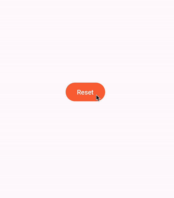
First, let's create a default dialog. A dialog in Jetpack Compose is shown/dismissed using a boolean state within composition.
if (showDialog) {
    Dialog(
        onDismissRequest = { showDialog = false },
    ) {
        ResetWarning(...)
    }
}

Button(
    onClick = { showDialog = true }
) {
    Text(text = "Reset")
}
Whenever we want to show the dialog, we set the boolean showDialog to true, and to false when it is time to dismiss it. We pass in the function onDismissRequest() to the dialog so that it can handle some dismissal events for us, for example, when the user taps the back button.
This code gives us this simple but functional dialog

CustomDialog composable
To make our lives easier, we shall create a wrapper composable around the Dialog where we shall implement our animations with our custom logic. CustomDialog will be defined similarly to Dialog but with only the options relevant to us.
@Composable
fun CustomDialog(
    showDialog: Boolean,
    onDismissRequest: () -> Unit,
    content: @Composable () -> Unit,
) {
    if (showDialog) {
        Dialog(
            onDismissRequest = onDismissRequest,
            properties = DialogProperties(
                usePlatformDefaultWidth = false
            )
        ) {
            Box(
                modifier = Modifier.fillMaxSize(),
                contentAlignment = Alignment.Center
            ) {
                Box(
                    Modifier
                        .pointerInput(Unit) { detectTapGestures { } }
                        .shadow(8.dp, shape = RoundedCornerShape(16.dp))
                        .width(300.dp)
                        .clip(RoundedCornerShape(16.dp))
                        .background(
                            MaterialTheme.colorScheme.surface,
                        ),
                    contentAlignment = Alignment.Center
                ) {
                    content()
                }

            }
        }
    }
}
In a real app, we would also define certain common custom styling here that we would like to apply to all dialogs in the app. For now, I just defined the background and shadow properties for our dialog.
Along with this, I have passed in a DialogProperties object stating that I would like to use the full width of the device.
We can then call CustomDialog like so in order to use it:
var showDialog by remember { mutableStateOf(false) }

CustomDialog(
	showDialog = showDialog,
	onDismissRequest = { showDialog = false }
) {
	ResetWarning(...)
}

Dispose of the defaults
By default, the dialog has an animation plus a scrim to darken the content below. For both of these, we want to implement it ourselves so as to have better control of our animation's look and feel.
To get rid of these, we just add the following code within the Dialog content block.
Dialog(...) {

    val dialogWindow = getDialogWindow()

    SideEffect {
        dialogWindow.let { window ->
            window?.setDimAmount(0f)
            window?.setWindowAnimations(-1)
        }
    }
	...
}

...

@ReadOnlyComposable
@Composable
fun getDialogWindow(): Window? = (LocalView.current.parent as? DialogWindowProvider)?.window
This will remove any system animations on the dialog window, as well as the background scrim. We will apply a custom scrim later on along with the dialog animation.

Custom animations
First thing we need to do is tweak the showDialog boolean. This boolean shows the dialog instantly and also dismisses it immediately it becomes false.
Showing the dialog instantly is good for our purposes, but we need to allow some time at the end to let the dismiss animation run till completion.
var showAnimatedDialog by remember { mutableStateOf(false) }

LaunchedEffect(showDialog) {
    if (showDialog) showAnimatedDialog = true
}

if (showAnimatedDialog) {
    Dialog(...) {...}
}
We can do this by creating a new boolean, showAnimatedDialog, that is set to true the moment showDialog is true. Later on, once we have defined our animation, we will handle setting showAnimatedDialog to false when the exit animation has completed.
Next, we need to make sure our animation starts and runs properly. We will be using AnimatedVisibility to animate in our dialog. AnimatedVisibility takes in a boolean to decide whether it shows or hides its content.
We want AnimatedVisibility to hide the content as we open the dialog and the moment it is visible, we run the animation.
var animateIn by remember { mutableStateOf(false) }
LaunchedEffect(Unit) { animateIn = true }
AnimatedVisibility(
    visible = animateIn && showDialog
) {...}
We accomplish this by creating a boolean state, animateIn, that starts as false and then it is set to true within a LaunchedEffect.
Note that we use showDialog in the visible parameter instead of showAnimatedDialog. This is in order to trigger the exit animation the moment showDialog is false. Inside the AnimatedVisibility content block, we will then set showAnimatedDialog to false like so:
AnimatedVisibility(...) {
	...
    DisposableEffect(Unit) {
        onDispose {
            showAnimatedDialog = false
        }
    }
}
This will set the boolean to false once the exit animation has finished running.
Now on to the animations. Remember that we had removed the system defined background scrim. We shall add it back now within it's own separate AnimatedVisibility. We shall keep it separate because it will require only a simple fade animation and we don't want it to be interfered with by other animations.
AnimatedVisibility(
    visible = animateIn && showDialog,
    enter = fadeIn(),
    exit = fadeOut(),
) {
    Box(
        modifier = Modifier
            .pointerInput(Unit) { detectTapGestures { onDismissRequest() } }
            .background(Color.Black.copy(alpha = .56f))
            .fillMaxSize()
    )
}
On top of the scrim, we shall add the dialog itself. Below, we have wrapped the dialog we had earlier with an AnimatedVisibility.
AnimatedVisibility(
    visible = animateIn && showDialog,
    enter = fadeIn(spring(stiffness = Spring.StiffnessHigh)) + scaleIn(
        initialScale = .8f,
        animationSpec = spring(
            dampingRatio = Spring.DampingRatioMediumBouncy,
            stiffness = Spring.StiffnessMediumLow
        )
    ),
    exit = slideOutVertically { it / 8 } + fadeOut() + scaleOut(targetScale = .95f)
) {
    Box(
        Modifier
            .shadow(8.dp, shape = RoundedCornerShape(16.dp))
            .width(300.dp)
            .clip(RoundedCornerShape(16.dp))
            .background(
                MaterialTheme.colorScheme.surface,
            ),
        contentAlignment = Alignment.Center
    ) {
        content()
    }

    DisposableEffect(Unit) {
        onDispose {
            showAnimatedDialog = false
        }
    }
}
For the animations, there is a quick fade in and a bouncy scale for showing the dialog and a slide, fade and scale for dismissing.
Note that the onDispose function for dismissing the dialog after the exit animation finishes is called here and not earlier in the scrim's AnimatedVisibility. Between the two animations, this will finish last after the scrim animation.

Just to add a little more visual intrigue, I added an expand animation on the graphic at the top of the dialog.
var graphicVisible by remember { mutableStateOf(false) }
LaunchedEffect(Unit) { graphicVisible = true }

AnimatedVisibility(
    visible = graphicVisible,
    enter = expandVertically(
        animationSpec = spring(stiffness = Spring.StiffnessMediumLow),
        expandFrom = Alignment.CenterVertically,
    )
) {
    // Warning Icon Graphic
}
I use the same pattern as before by setting graphicVisible to false and then setting it to true within a LaunchedEffect.
Finally, we have this delightful dialog animation. I hope you learned something new and will implement some of your own custom dialog animations. Code is available on Github.
Thanks for reading and good luck!
Subscribe for UI recipes