Bottom Navigation Animation in Jetpack Compose
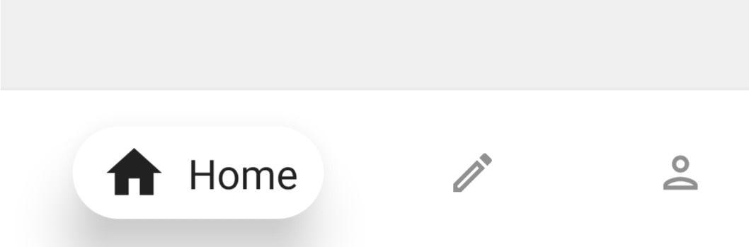
Bottom navigation UI is used to navigate between different top level screens in apps. There is a composable available in the compose libraries, but it could be improved with some more animations. Using only the animation components provided in the jetpack compose libraries, we could implement a more custom bottom navigation UI. This is the custom bottom navigation UI I will be creating in this article.
First step would be to recreate the bottom navigation UI without any animation.
@ExperimentalAnimationApi
@Composable
fun BottomNavNoAnimation(
    screens: List<Screen>
) {
    var selectedScreen by remember { mutableStateOf(0) }
    Box(
        Modifier
			.shadow(5.dp)
            .background(color = MaterialTheme.colors.surface)
            .height(64.dp)
            .fillMaxWidth()
            .padding(horizontal = 16.dp)
	) {
        Row(
            Modifier.fillMaxSize(),
            verticalAlignment = Alignment.CenterVertically,
        ) {
            for (screen in screens) {
                val isSelected = screen == screens[selectedScreen]
                Box(
                    modifier = Modifier.weight(if (isSelected) 1.5f else 1f),
                    contentAlignment = Alignment.Center,
                ) {
                    val interactionSource = remember { MutableInteractionSource() }
                    BottomNavItem(
                        modifier = Modifier.clickable(
                                interactionSource = interactionSource,
                                indication = null
							) {
                                selectedScreen = screens.indexOf(screen)
                            },
                        screen = screen,
                        isSelected = isSelected
                    )
                }
            }
        }
    }
}
In the code above, I first pass in the list of screens that will be represented in the bottom navigation. Screen is a sealed class defined as:
sealed class Screen(
    val title: String,
    val activeIcon: ImageVector,
    val inactiveIcon: ImageVector
) {
    object Home: Screen("Home", Icons.Filled.Home, Icons.Outlined.Home)
    object Create: Screen("Create", Icons.Filled.Create, Icons.Outlined.Create)
    object Profile: Screen("Profile", Icons.Filled.Person, Icons.Outlined.Person)
    object Settings: Screen("Settings", Icons.Filled.Settings, Icons.Outlined.Settings)
}
In this case, every item contains a title plus active and inactive icons defined as image vectors. This can be edited to use locally stored images, or even extended to also store unique colors for each item while active. Next, there is the state selectedScreen, which will be used to keep track of the currently selected bottom nav item. The bottom navigation view itself is a simple Box with shadow, color and size applied through modifiers. The bottom navigation items are arranged in a Row. All bottom navigation items have the same weight of 1f, except the currently selected item, which will have a weight of 1.5f.
The BottomNavItem composable contains all the ui for the individual bottom navigation items.
@ExperimentalAnimationApi
@Composable
private fun BottomNavItem(
    modifier: Modifier = Modifier,
    screen: Screen,
    isSelected: Boolean,
) {
    Box(
        modifier = modifier.fillMaxSize(),
        contentAlignment = Alignment.Center,
    ) {
        Row(
            modifier = Modifier
				.height(if (isSelected) 36.dp else 26.dp)
                .shadow(
                    elevation = if (isSelected) 15.dp else 0.dp,
                    shape = RoundedCornerShape(20.dp)
                )
                .background(
                    color = MaterialTheme.colors.surface,
                    shape = RoundedCornerShape(20.dp)
                ),
            verticalAlignment = Alignment.CenterVertically,
            horizontalArrangement = Arrangement.Center,
        ) {
            Icon(
                rememberVectorPainter(
					image = if (isSelected) screen.activeIcon else screen.inactiveIcon
				),
                contentDescription = screen.title,
                modifier = Modifier
					.align(Alignment.CenterVertically)
                    .fillMaxHeight()
                    .padding(start = 11.dp)
                    .alpha(if (isSelected) 1f else .5f)
                    .size(if (isSelected) 26.dp else 20.dp),
            )

            if (isSelected) {
                Text(
                    text = screen.title,
                    modifier = Modifier.padding(start = 8.dp, end = 10.dp),
                    maxLines = 1,
                )
            }
        }
    }
}
The screen that the BottomNavItem should represent and whether it is currently selected or not are passed in. When selected, the Row would have a larger height with rounded corners and a shadow. The icon would use the activeIcon from the screen parameter and is larger with a full opacity. Also, the title of the screen is only visible when an item is currently selected. When unselected, the Row is smaller with no shadow nor corners and the title is hidden. The inactiveIcon is also used in this case.
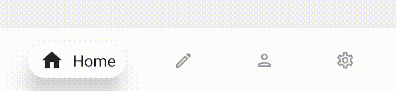
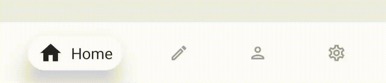
So far, the bottom navigation is functional but without any animations
Now with a working UI, animations can be added.
...
for (item in screens) {
    val isSelected = item == screens[selectedScreen]
    val animatedWeight by animateFloatAsState(targetValue = if (isSelected) 1.5f else 1f)
    Box(
        modifier = Modifier.weight(animatedWeight),
        contentAlignment = Alignment.Center,
    ) {
...
First, the weight of the currently selected item can be animated. When an item is selected, it will smoothly animate to take up more space as the previously selected item animates to the default weight.
That's it for the BottomNav composable. In the BottomNavItem composable, there are more animations used. Here are the animation values:
...
private fun BottomNavItem(...) {
	val animatedHeight by animateDpAsState(targetValue = if (isSelected) 36.dp else 26.dp)
	val animatedElevation by animateDpAsState(targetValue = if (isSelected) 15.dp else 0.dp)
	val animatedAlpha by animateFloatAsState(targetValue = if (isSelected) 1f else .5f)
	val animatedIconSize by animateDpAsState(
	    targetValue = if (isSelected) 26.dp else 20.dp,
	    animationSpec = spring(
	        stiffness = Spring.StiffnessLow,
	        dampingRatio = Spring.DampingRatioMediumBouncy
	 )
	)
...
}
All animations are set up with the same two states from the non-animated example, but in this case, there is a smooth transition when the isSelected boolean changes. And here is how these values are applied:
...
Row(
    modifier = Modifier
		.height(animatedHeight)  // <-------
        .shadow(
            elevation = animatedElevation,  // <-------
            shape = RoundedCornerShape(20.dp)
        )
        .background(
            color = MaterialTheme.colors.surface,
            shape = RoundedCornerShape(20.dp)
        ),
    verticalAlignment = Alignment.CenterVertically,
    horizontalArrangement = Arrangement.Center,
) {
    FlipIcon(
        modifier = Modifier
			.align(Alignment.CenterVertically)
            .fillMaxHeight()
            .padding(start = 11.dp)
            .alpha(animatedAlpha)  // <-------
            .size(animatedIconSize),  // <-------
        isActive = isSelected,
        activeIcon = item.activeIcon,
        inactiveIcon = item.inactiveIcon,
    )

    AnimatedVisibility(visible = isSelected) {
        Text(
            text = item.title,
            modifier = Modifier.padding(start = 8.dp, end = 10.dp),
            maxLines = 1,
        )
    }
}
...
This makes creating animations in compose so easy. One can easily define the states of an animation and easily use the interpolated values with little changes to the original code. There are two more changes in this last piece of code over the original. First, the Text composable is wrapped in an AnimatedVisibilityinstead of an if statement. This gives it an animation as it appears and disappears. Second, the Icon composable is now replaced with a custom composable, FlipIcon. This composable applies a flip animation on the icon as it transitions between the activeIcon and the inactiveIcon.
Here is the code for the FlipIcon composable:
@Composable
fun FlipIcon(
    modifier: Modifier = Modifier,
    isActive: Boolean,
    activeIcon: ImageVector,
    inactiveIcon: ImageVector,
    contentDescription: String,
) {
    val animationRotation by animateFloatAsState(
        targetValue = if (isActive) 180f else 0f,
        animationSpec = spring(
            stiffness = Spring.StiffnessLow,
            dampingRatio = Spring.DampingRatioMediumBouncy
 )
    )
    Box(
        modifier = modifier
			.graphicsLayer { rotationY = animationRotation },
        contentAlignment = Alignment.Center,
    ) {
        Icon(
            rememberVectorPainter(image = if (animationRotation > 90f) activeIcon else inactiveIcon),
            contentDescription = contentDescription,
        )
    }
}
And with that, the bottom navigation UI with animations is complete. Well, maybe not fully complete. To go further and implement it in a real app, look at the android docs on integrating with the navigation library and apply that here.
Thanks for reading and good luck!
Subscribe for UI recipes